Simple Homepage
The Simple homepage method allows you to have two rows of content filled with various components.
In this Section:
Top Row
The top row contains the large "hero" image and an optional column on either side. If you are using a Left or Right aligned hero image, you can also populate content in a column that displays adjance to the image.
Hero Image
Please refer to the Hero Image section for more detail about creating the hero image.
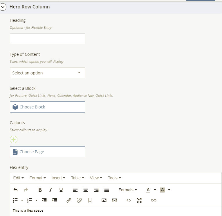
Hero Row Column
Heading: The heading element is used by the Flexible Entry option only. Other components have headings which are assigned on their specific blocks.
Type of Content - You may choose from one of the following options. Please select one item from the drop-down menu:
- Callouts
- Select Callouts from the drop down.
- Use the Callouts > Search page chooser to select callout pages from the /components/callouts folder.
- Note: you may only select two for the hero row position (the bottom row may have more than 2).
- Audience Nav: select this option from the drop-down list, and then use the Select a Block option to select the appropriate block from the /components/audience-nav folder.
- Quick Links: select this option from the drop-down list, and then use the Select a Block option to select the appropriate block from the /components/quick-links folder.
- Feature: select this option from the drop-down list, and then use the Select a Block option to select the appropriate block from the /components/feature folder.
- Profile: select this option from the drop-down list, and then use the Select a Block option to select the appropriate block from the /components/profile folder.
- Testimonial: select this option from the drop-down list, and then use the Select a Block option to select the appropriate block from the /components/testimonials folder.
- Social Media Icons: select this option from the drop-down list, and then use the Select a Block option to select the appropriate block from the /components/social-media-list folder.
- Flexible Entry:
- Select Flexible Entry from the drop-down.
- Add an optional Heading.
- Enter your text in the Flex Entry space provided (beneath the Callouts selection options).
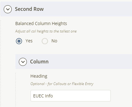
Second Row
The second, lower row can contain up to 4 columns worth of content. Column widths will be automatically generated based on whether or not your row contains callouts, and the number of columns that your layout contains.
Balanced Column Heights: At the top of the Bottom Row options, this setting (checked by default) will enable auto-adjustment of the height of columns entered in a row so that any of the gray box-styled elements created will appear balanced.
Second Row - Columns
Use the Column controls to manage columns of content in your row. Your homepage will by default contain 3 columns already created, which are set to the Flexible Entry option. You may add, delete, or re-order these columns using the + (plus icon), down arrow sign or the red X icon next to each column.
For each Second Row > Column entry, enter the following as appropriate:
Heading: This optional heading applies to Callouts or Flexible Entry components only.
Type of Content - You may choose from one the following options. Please select one item from the drop-down menu:
- Callouts
- Select Callouts from the drop down.
- Click on the Callouts > Search option to select callout pages from the /components/callouts folder.
- Click on the Plus sign icon to add additional callouts. You may add, remove, or re-order callouts using the + (plus icon), down arrow sign or the red X icon.
- You may select multiple callouts for the bottom row (unlike the Top Row, which is limited to 2).
- Audience Nav: select this option from the drop-down list, and then use the Select a Block option to select the appropriate block from the /components/audience-nav folder.
- Quick Links: select this option from the drop-down list, and then use the Select a Block option to select the appropriate block from the /components/quick-links folder.
- Feature: select this option from the drop-down list, and then use the Select a Block option to select the appropriate block from the /components/feature folder.
- News Center Widget: select this option from the drop-down list, and then use the Select a Block option to select the appropriate block from the /components/news-widget folder
- Misc Feed: select this option from the drop-down list, and then use the Select a Block option to select the appropriate block from the /components/misc-feed-block folder.
- Profile: select this option from the drop-down list, and then use the Select a Block option to select the appropriate block from the /components/profile folder.
- Testimonial: select this option from the drop-down list, and then use the Select a Block option to select the appropriate block from the /components/testimonials folder.
- Social Media Icons: select this option from the drop-down list, and then use the Select a Block option to select the appropriate block block from the /components/social-media-list folder.
- Flexible Entry:
- Select Flexible Entry from the drop-down.
- Add an optional Heading.
- Enter your text in the Flex Entry space provided (beneath the Callouts selection options)