Standard Template V3 Documentation
1. Account Interface
1.1 Log In
Please note as of March 1, 2023, VPN is required for Cascade access.
If you can't log in or access your site, put in a ticket with the OIT Service Desk. Be sure to include your netid and the site(s) you need to access.
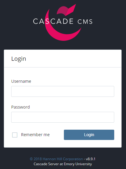
Using recommended web browsers such as Google Chrome or Mozilla Firefox, log in to Cascade with your Emory NetID and password. Your NetID must be all lower case.
1.2 Dashboard
By default, the dashboard includes the following widgets:
- My Sites - Recently visited websites are listed here. Select one or use the site dropdown menu to view all permissible sites.
- My Content - Access recently-viewed assets from this widget.
- Notifications - Messages such as publish reports are listed here.
Customizing the Dashboard
- Add a Widget: To add a widget, click the Add Widget button located underneath your name in the Welcome back box. Click the plus button (⨁) and select the widget type you would like to add.
- Customize a Widget: To customize a widget, hover over the right side of the widget box and click the pencil icon located at the upper-right corner of the widget box. Make your desired changes or modifications, and click Save Settings.
- Delete a Widget: To delete a widget, select the widget you wish to remove by hovering over the right side of the widget box and clicking the X button. Click OK to confirm that you want to remove the widget from your dashboard.
1.3 Find Webpages & Documents
To find a site in Cascade, click the drop-down menu next to the Cascade Server logo  and select your site from the list.
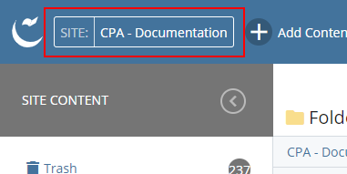
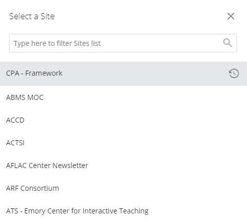
Search for a site by typing into the drop-down menu.
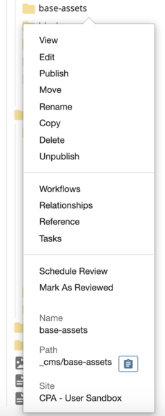
The folder view is an easy way to see and access the files and folders that make up the website. It is located on the left side of the screen under Site Content. When a folder is selected, right-click the folder, and a list of options will appear allowing you to select an option for further action.
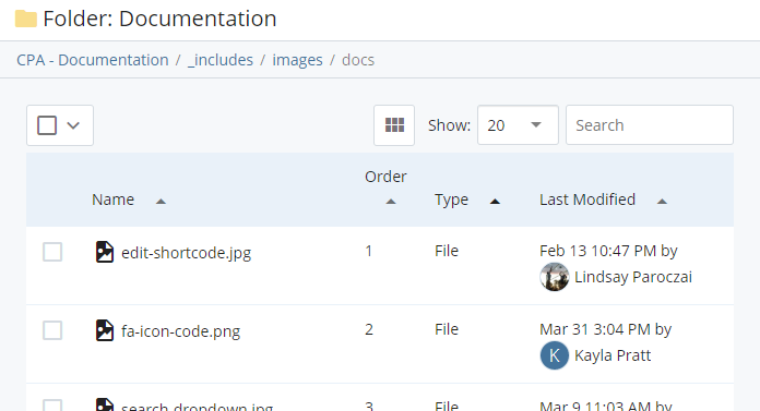
Icons for folders, images, and documents
The following icons are used to represent various assets in a website:
- Web Pages
 are shown with the paper icon
 - Documents (.pdf, .doc, .jpg)
 are shown with the photograph icon
 - Blocks
 are shown with the cube icon
 - Folders
 are shown with the manila folder icon
Locating images and documents
Images (.jpg, .png, or .gif) and documents (.pdf, .docx, etc.) are typically stored in subfolders:
- Images: /_includes/images
- Documents: /_includes/documents
Editing existing documents
It is important to preserve references and links to documents and files when updating them. To update a file:
- Navigate to the document in Cascade (this could be an image, Word document, PDF, etc.).
- Click "Edit" in the top right corner of the window.
- Drag and drop the updated file into the window or manually navigate to the file on the computer to upload it. Click "Submit" to save the new version of the file.
- Publish the file if ready to do so to make it show up on the live website.
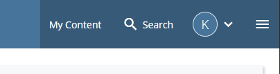
1.4 Search Bar
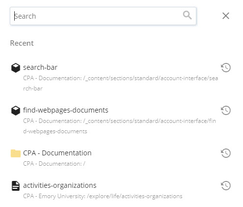
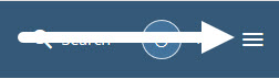
The Search Bar is always available in the top right corner of the web browser when logged in to Cascade.
Using search, enter keywords, titles, or names to quickly navigate to content blocks, pages, and documents. Click the search bar to reveal and navigate to recent assets.
2. Editing Pages
2.1 Editing Basics
To edit a page, navigate to the page in Cascade and click the edit button  or right click on the page in the folder structure and select Edit. A screen will pop up with your page in edit view.
If you're editing your page but can't see any content, it's likely the content is contained within a row block or a shortcode block. You can right-click to edit any of the blocks directly from the page.
2.2 WYSIWYG Editor
A WYSIWYG (What You See Is What You Get) is a Rich Text editor that provides tools to robustly format text in ways such as adding lists, bold text, links, and more.
Cascade's WYSIWYG editor may seem familiar to those who are experienced with text editors such as Microsoft Word, MacOS Pages, or Google Docs, but there are notable differences in some of the functions.
Common Formatting Options
- Bold
- Italic
- Link/URL
- Insert an image
- Insert a table
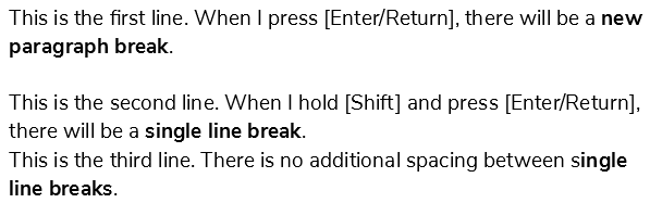
Line Breaks
- To add a new paragraph break - Press Enter (Windows) or Return (Mac)
- To add a single line break - Hold Shift and press Enter/Return
Headings
Heading hierarchy is an important component of structuring content, enabling readers to easily absorb and understand the page's content.
Proper heading hierarchy allows Google, Bing, and other search engines to better index and promote the website for new readers to find. Finally, proper use of headings is important for maintaining ADA compliance, extending our reach to more audiences.
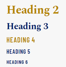
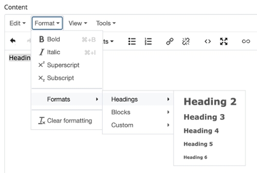
To apply a heading style. select the text, then click on the Formats dropdown menu, and choose the appropriate subheading starting with Heading 2. Do not skip heading levels.
2.2.A Copy & Paste Text
Pasting text from an application such as Microsoft Word or Google Docs can be done by right-clicking or with keyboard shortcuts.
- Windows copy/paste - CTRL + C to copy, then CTRL + V to paste
- Mac copy/paste - CMD + C to copy, then CMD + V to paste
Avoid unwanted Rich Text formatting
Text that is copied and pasted directly from a webpage or Rich Text editor such as Microsoft Word or Google Docs will retain its formatting. While sometimes convenient, this often leads to display issues. In order to avoid this, use the Paste as text option in the Edit menu inside the WYSIWYG editor.
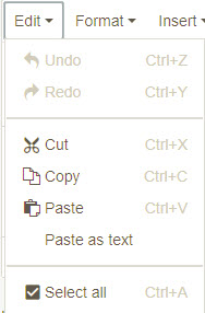
Clear Rich Text formatting
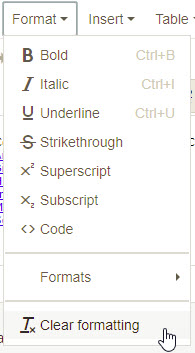
Select text that needs formatting cleared and click Format from the toolbar menu. Select Clear Formatting.
2.2.B List Styles
Different formatting options are available for a list that can modify the layout and bullet appearance.
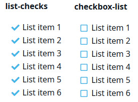
Bullet appearance
Checks and checkboxes are an alternate to bulleted or numbered lists. Highlight the whole list and choose Formats > Custom and choose the desired style.
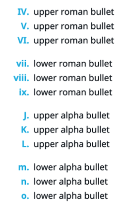
Alpha Upper Case, Alpha Lower Case, Roman Upper Case and Roman Lower Case list styles are also available. Highlight the list, click the Ordered List button, and with the whole list highlighted, choose Formats > Custom and choose the desired style:
- ol-lower-alpha
- ol-upper-alpha
- ol-lower-roman
- ol-upper-roman
Column layout
Longer lists can be organized into up to four columns by using several CSS class modifiers via the text/code view in the WYSWIYG editor.
Available modifiers:
.list-cols-2.list-cols-3.list-cols-4
How to use the column modifiers:
- First, add the
.list-colsrule to the<ul>or<ol>element. - Next, add the modifier rule that determines the number of columns in the list, such as
.list-cols-3for a three column list. - Optional: Choose a bullet appearance such as
.list-orderedor.list-unordered.
Final markup:
<ol class="list-cols list-cols-3 list-ordered">
    <li>List item one</li>
    <li>List item two</li>
    <li>List item three</li>
    <li>List item four</li>
    <li>List item five</li>
    <li>List item six</li>
    <li>List item seven</li>
    <li>List item eight</li>
</ol>
Final result:
- List item one
- List item two
- List item three
- List item four
- List item five
- List item six
- List item seven
- List item eight
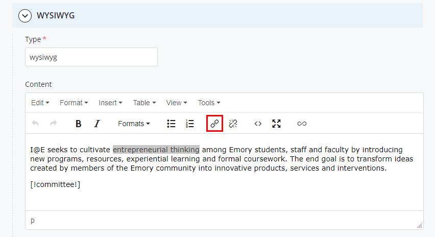
2.2.C Create a Link
Select the word or phrase to be linked and click on the Link icon: 
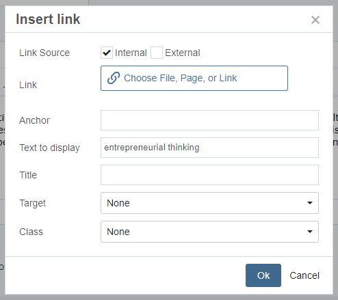
Internal Link
The internal link sends the reader to another part of your Cascade site.
Click Choose File, Page, or Link.
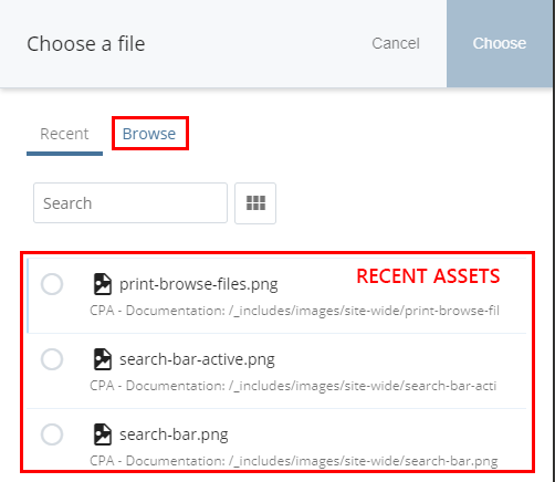
Next, navigate to the page or document to be linked to. There are two options for linking internal assets…
- choose an asset that was recently referenced from a list, or
- browse through all available assets.
The Recent assets tab is selected by default.
- Click on the Browse tab in order to bring up the asset browser:
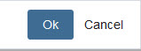
- Select a link by clicking on the radio button (gray circle) to the left.
- Once the link is selected, click Choose in the top right corner.
- Last, insert the link with the bottom right Ok button:
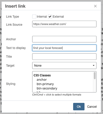
External Link
Use an external link for any URL not represented in your Cascade site.
Choose External, then type in or paste in the full URL.
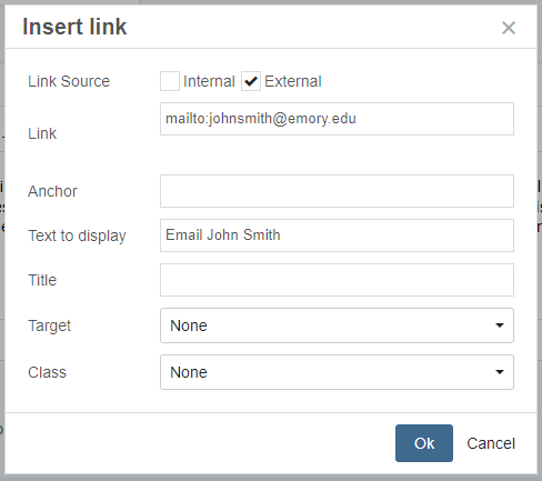
Email link
Choose the External link option. In the address box, type mailto: followed by the email address:
Example: mailto:johnsmith@emory.edu
Remove link
Select the link text, then click the Remove Link button: 
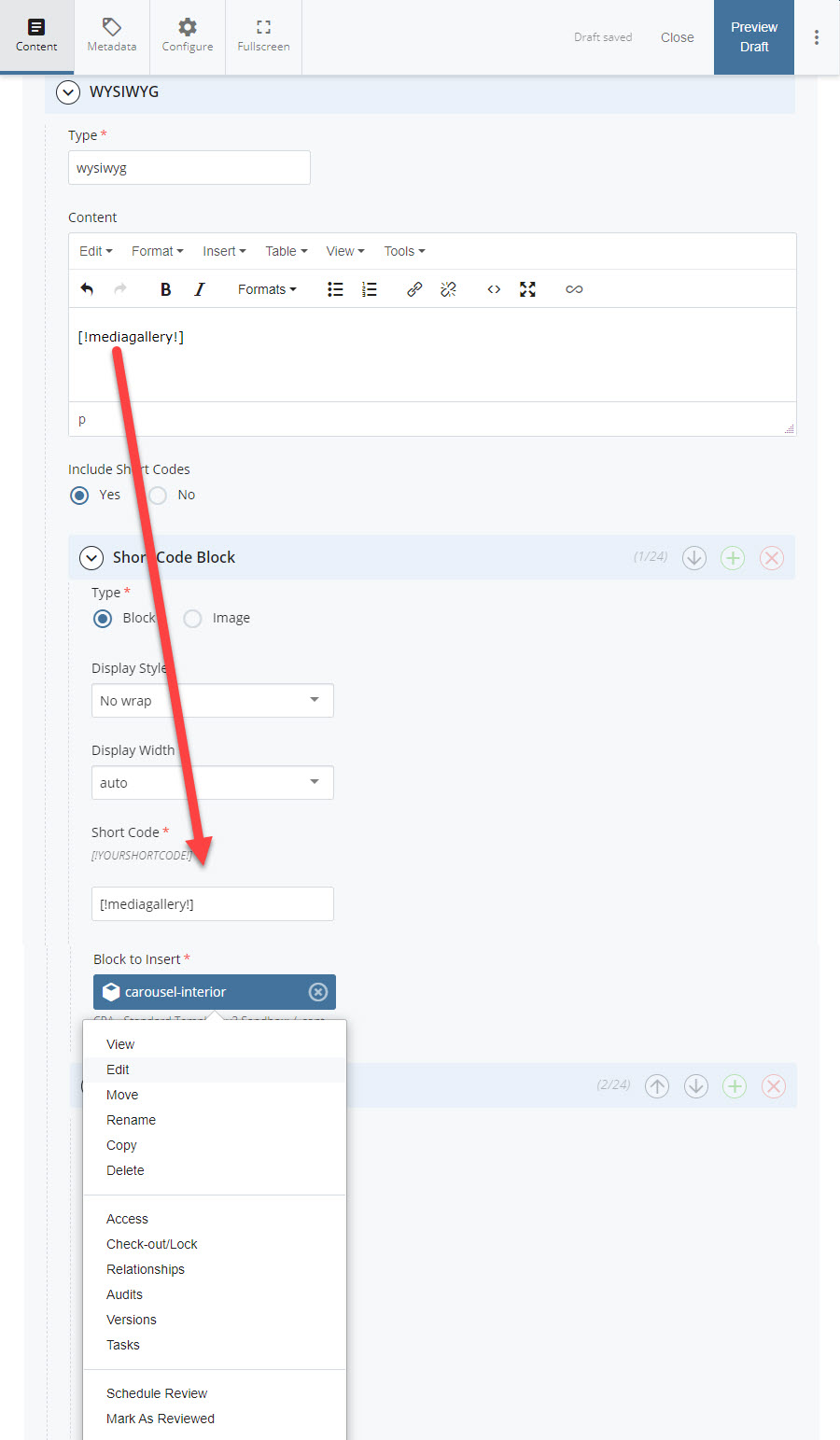
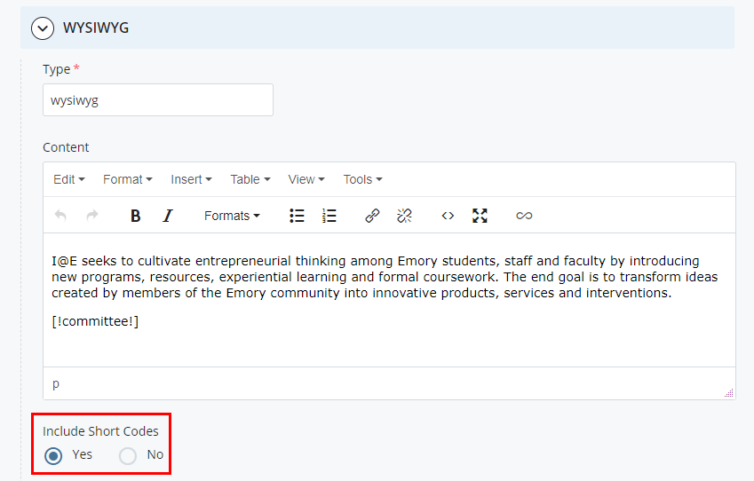
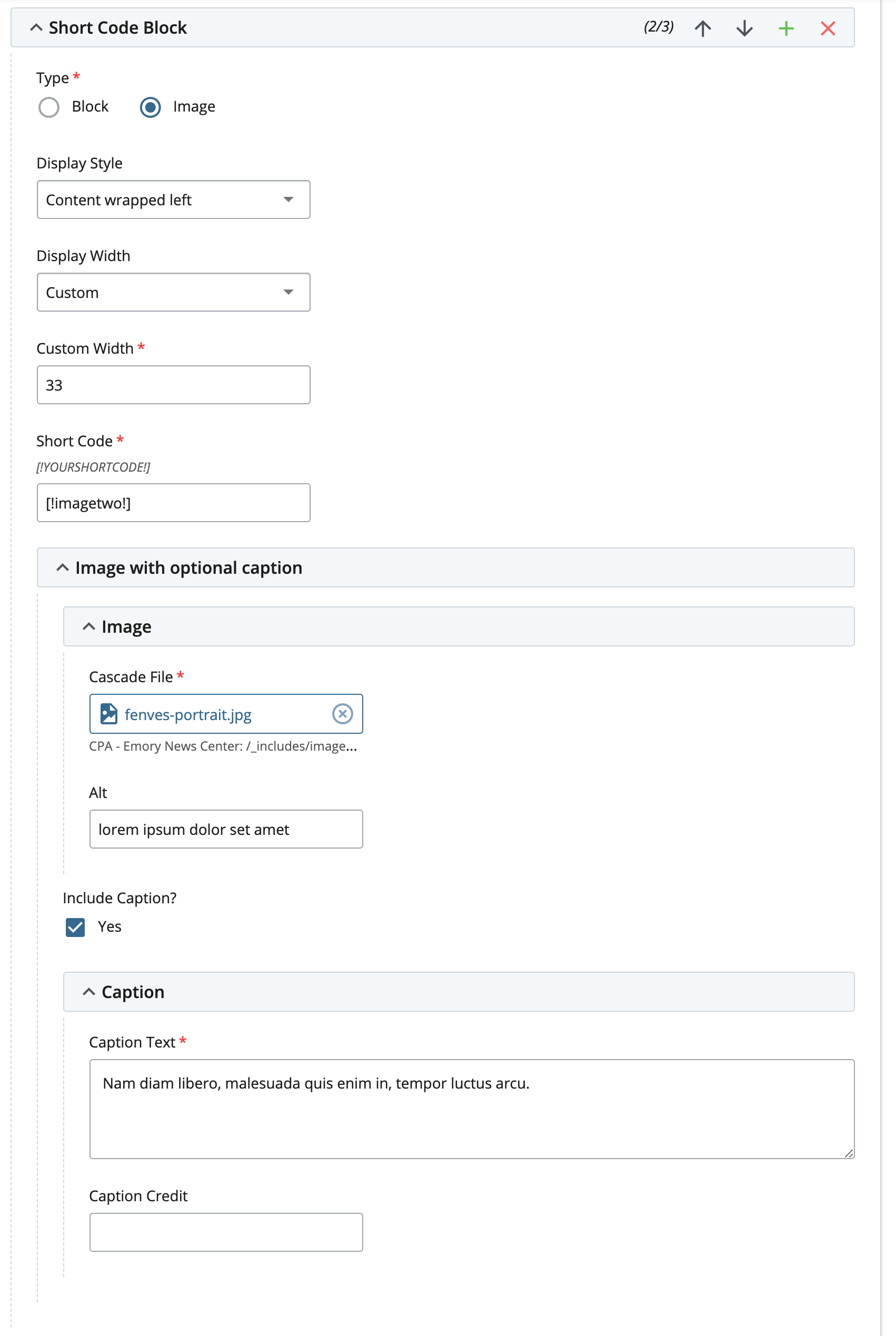
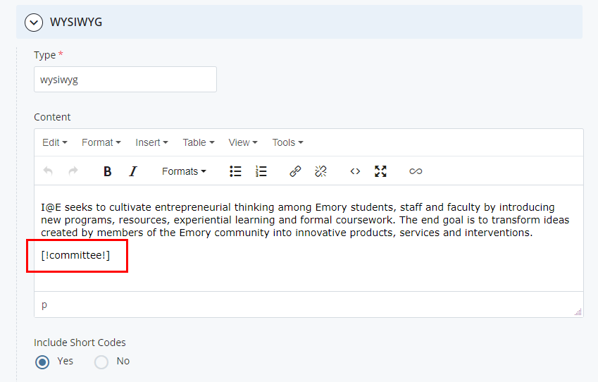
2.2.D Shortcodes
Shortcodes allow images or content blocks to be imported into a WYSIWYG editor interface.
Create a Shortcode
To include shortcodes in the WYSIWYG editor, select Yes next to Include Shortcodes.
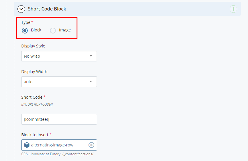
Select a shortcode type:
- Image: Choose the image file and navigate to the file in the /_includes/images folder. Select whether the image will have a caption and fill out the caption information if so. Limit your caption text to 15 words or less:
- Block: Select the block in Cascade under /_content:
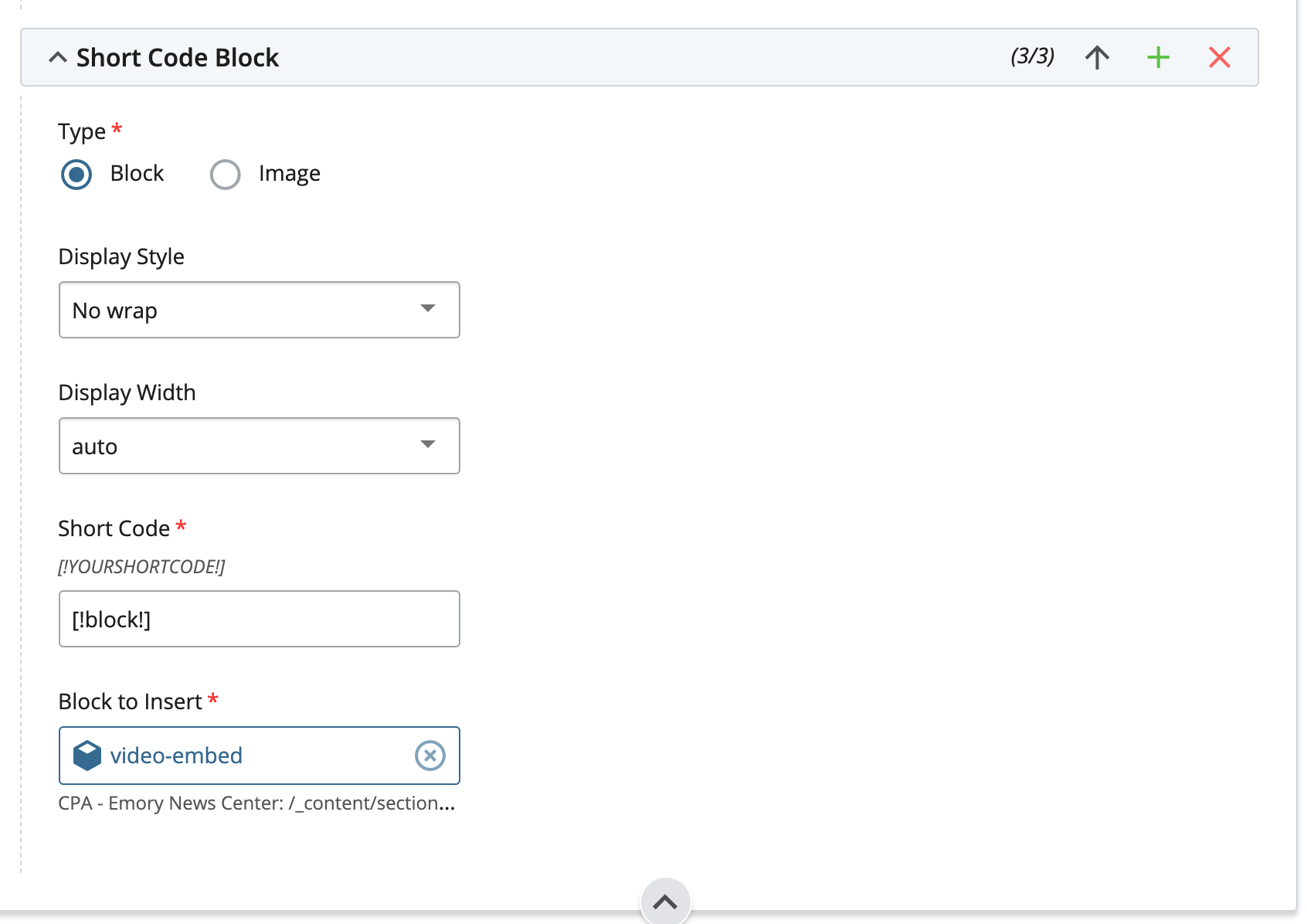
Shortcodes must be entered in a specific format.
[! (Open bracket and exclamation point)
shortcodename (Lowercase text)
!] (Closing exclamation point and bracket)
All together, a shortcode looks like this: [!shortcodename!]
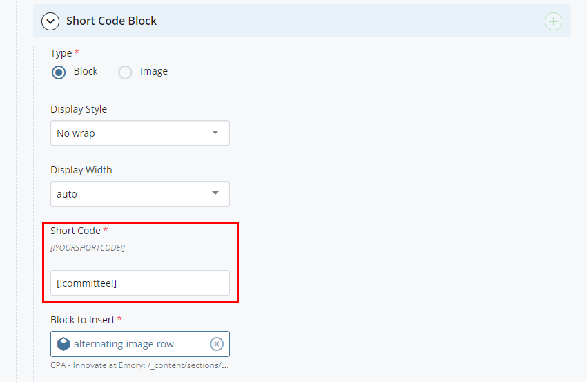
Shortcode Display Style and Display Width
A few display options are available:
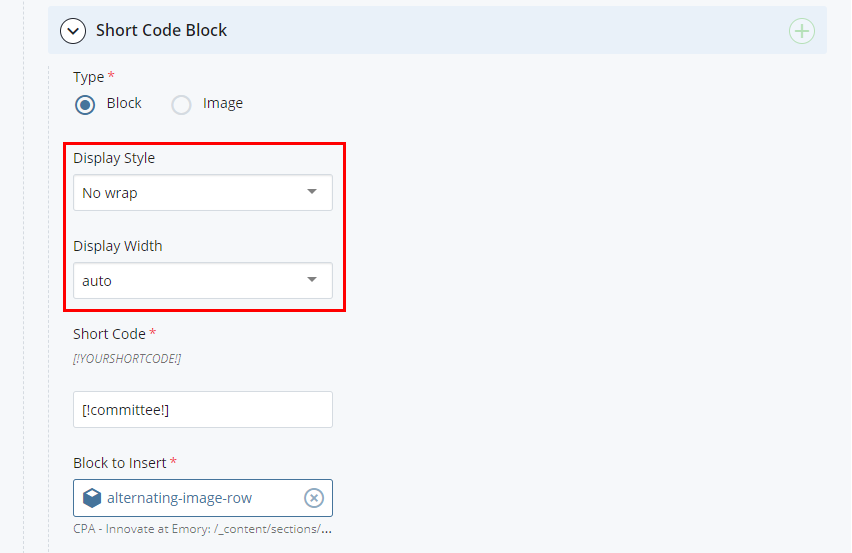
- No Wrap: text will display under block or image regardless of display width percentage.
- Content wrapped right: text will wrap to the right of the block or image.
- Content wrapped left: text will wrap to the left of the block or image.
- Width 100: block or image will display at 100% width.
- Width 75: block or image will display at 75% width.
- Width 50: block or image will display at 50% width.
- Width 25: block or image will display at 25% width.
- Width auto: block or image will display at 100% width.
Insert Shortcode Into Content
Insert the shortcode text into the WYSIWYG editor where it should appear within the text.
Multiple Shortcodes can be included in the WYSIWYG editor. Simply add another shortcode in the editor and click the green plus icon to add another shortcode block or image.
Shortcode names should be unique and may only contain numbers and letters - no special characters, including dashes (-) and underscores (_).
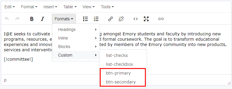
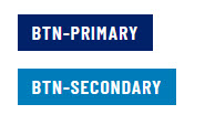
2.2.E Button styles
There are two appearance options for button links. To change the button link style, highlight the link text and click Formats > Custom and choose the desired style.
2.3 Format Plain Text
Many of the input fields within Cascade uses Plain Text rather than the Rich Text of the WYSIWYG editor.
Apply formatting to Plain Text
Tags surrounded by opening and closing brackets [tag] can be used to format Plain Text.
| Type | Input | Output |
|---|---|---|
| Bold | [bold]bold[/bold] | bold |
| Italic | [italic]italic[/italic] | italic |
| Normal (used for title formatting in italicized text) | [normal]normal[/normal] | Credit Good Housekeeping Magazine |
| Emphasis | [em]emphasis[/em] | emphasis |
| Superscript | [sup]superscript[/sup] | superscript |
| en dash | [endash] | – |
| em dash | [emdash] | — |
| Single Quote | [sq] | ' |
| Double Quote | [q] | " |
| Smart Single Quote – open | [opensmartsinglequote] | ‘ |
| Smart Single Quote – close | [closesmartsinglequote] | ’ |
| Smart Double Quote – open | [opensmartdoublequote] | “ |
| Smart Double Quote – close | [closesmartdoublequote] | ” |
| Apostrophe | [apostrophe] | ’ |
| Ampersand | [amp] | & |
| Copyright | [copy] | © |
| Registered Trademark | [r] | ® |
| Less Than | [lt] | < |
| Greater Than | [gt] | > |
2.4 Tables
Tables require an intermediate level of HTML knowledge in order to utilize them properly and to ensure that they are accessible to all audiences. Some rules of thumb:
- Do not use tables to visually alter content or create special layouts
- Ensure each table has a caption element
- Assign accessibility attributes to table elements when appropriate
All content editors must thoroughly study these resources before attempting to create tables on Emory websites:
- https://www.w3.org/WAI/tutorials/tables/ - Advanced layouts
- https://webaim.org/techniques/tables/data - Accessibility
2.4.A Table Markup
To design for screen reader compatibility, table markup must be pasted in the HTML code directly to properly indicate and link the header and data cells. Tables provide users with information about relationships and how content is organized, and makes it easier for users to sort through information. When structural markup is in place, screen reader users are able to navigate a data table one cell at a time and will hear the column and row headers spoken to them.
Below is a recommended basic template that includes a table caption, header, footer, and data cells.
<table>
  <!-- CAPTION -->
  <caption>
    <!-- Note: Ensure the proper heading level is chosen for the table caption -->
    <h2>Title or purpose of table</h2>
    <p>Optional extended description.</p>
  </caption>
  <!-- HEADER -->
  <thead>
    <tr>
      <th scope="col">Header Item One</th>
      <th scope="col">Header Item Two</th>
      <th scope="col">Header Item Three</th>
    </tr>
  </thead>
  <!-- FOOTER -->
  <tfoot>
    <tr>
      <th scope="col">Footer Item One</th>
      <th scope="col">Footer Item Two</th>
      <th scope="col">Footer Item Three</th>
    </tr>
  </tfoot>
  <!-- BODY -->
  <tbody>
    <tr>
      <td>Table Data One</td>
      <td>Table Data Two</td>
      <td>Table Data Three</td>
    </tr>
  </tbody>
</table>
| Header Item One | Header Item Two | Header Item Three |
|---|---|---|
| Footer Item One | Footer Item Two | Footer Item Three |
| Table Data One | Table Data Two | Table Data Three |
2.4.B Table Elements
Caption
The <caption> element is required.
Give a title to the table that is specific and concise using a heading element (<h2> through <h6>). Further details can be added with the <p> element.
Header
The <thead> element is optional but recommended.
Add columns with <th scope="col">, ensuring the scope attribute is applied for accessibility.
Footer
The <tfoot> element is optional.
Add columns with <th scope="col">, ensuring the scope attribute is applied for accessibility.
The footer columns may also be used to add disclaimers and other relevant information.
If a footer is added, it must be located above the <tbody> element. It will always visually appear at the bottom of the table.
Body
The <tbody> element is required.
Add columns with <td>, ensuring the data is properly aligned with the corresponding <th>.
2.4.C Table Style Options
Class attributes can be added to modify the appearance of the table.
Unstriped Table
<table class="table-unstriped">
| Header Item One | Header Item Two | Header Item Three |
|---|---|---|
| Footer Item One | Footer Item Two | Footer Item Three |
| Table Data One | Table Data Two | Table Data Three |
| Lorem | Ipsum | Vestibulum |
| Lorem | Ipsum | Vestibulum |
Bordered Table
<table class="table-bordered">
| Header Item One | Header Item Two | Header Item Three |
|---|---|---|
| Footer Item One | Footer Item Two | Footer Item Three |
| Table Data One | Table Data Two | Table Data Three |
| Lorem | Ipsum | Vestibulum |
| Lorem | Ipsum | Vestibulum |
Borderless Table
<table class="table-borderless">
| Header Item One | Header Item Two | Header Item Three |
|---|---|---|
| Footer Item One | Footer Item Two | Footer Item Three |
| Table Data One | Table Data Two | Table Data Three |
| Lorem | Ipsum | Vestibulum |
| Lorem | Ipsum | Vestibulum |
Small Table
<table class="table-sm">
| Header Item One | Header Item Two | Header Item Three |
|---|---|---|
| Footer Item One | Footer Item Two | Footer Item Three |
| Table Data One | Table Data Two | Table Data Three |
| Lorem | Ipsum | Vestibulum |
| Lorem | Ipsum | Vestibulum |
Dark Blue Header
<thead class="thead-dark">
| Header Item One | Header Item Two | Header Item Three |
|---|---|---|
| Footer Item One | Footer Item Two | Footer Item Three |
| Table Data One | Table Data Two | Table Data Three |
| Lorem | Ipsum | Vestibulum |
| Lorem | Ipsum | Vestibulum |
White Header
<thead class="thead-white">
| Header Item One | Header Item Two | Header Item Three |
|---|---|---|
| Footer Item One | Footer Item Two | Footer Item Three |
| Table Data One | Table Data Two | Table Data Three |
| Lorem | Ipsum | Vestibulum |
| Lorem | Ipsum | Vestibulum |
Themed Table
<table class="table-theme">
| Header Item One | Header Item Two | Header Item Three |
|---|---|---|
| Footer Item One | Footer Item Two | Footer Item Three |
| Table Data One | Table Data Two | Table Data Three |
| Lorem | Ipsum | Vestibulum |
| Lorem | Ipsum | Vestibulum |
3. Images and Documents
3.1 Upload Images & Documents
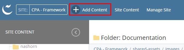
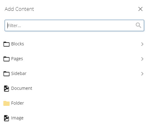
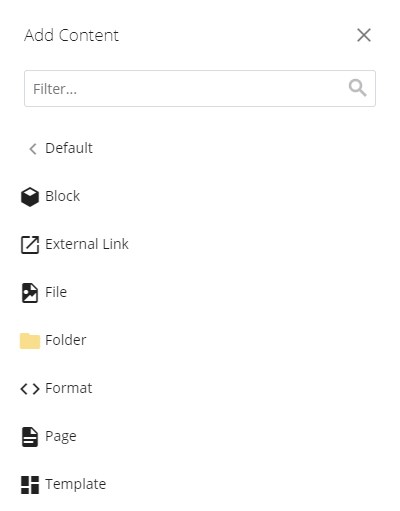
Images and documents must be proactively uploaded to Cascade before they can be placed on webpages. To add a document or image to Cascade:
- Click the Add Content > Document/Image option.
This opens a fly-out menu - choose the type of file to be added.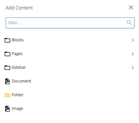
- After selecting a file via the file browser or by dragging and dropping in a new file, click the three-dot (kebab) menu and Submit to proceed.
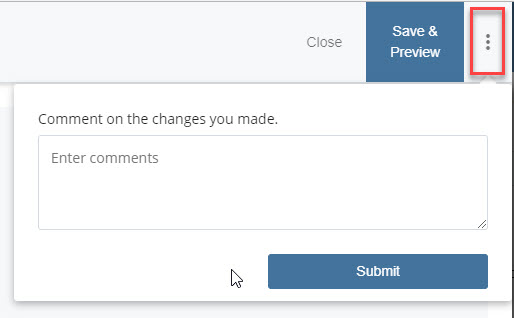
- Last, click the Publish tab, and click Submit at the bottom.
Publish an image by right-clicking the item in the left-hand file tree and selecting Publish in the dropdown menu.
Documents can be linked to in the WYSIWYG editor in the same way pages can be linked to.
Download instructions for updating files
3.2 Accessibility, cropping, and optimization
3.2.A Images with Text
Generally an image should be a visual enhancement of text content and images should not contain text themselves. Images of fliers, for example, should not be used as they contain text that may not be perceived by users who cannot load images or have limited vision.

Accessibility issues in the flier image above:
- A limited-vision user may not be able to process the information on the flier
- A user with a slow internet connection, limited mobile data, or who has disabled images from loading on the page would not get any information from the flier
- This image contains a colored link that may be perceived as clickable, even though it is not
- The contrast between the text colors and background may not be sufficient for legibility
- The background textures may interfere with the ability of some to perceive the text
3.2.B Portrait Images in Landscape Containers
Portrait photos are often taken vertically, and despite being a high-resolution image, cannot be made to fill a horizontal or landscape container.
In the example below, the image size is 1536 pixels wide and 1920 pixels tall (1536x1920).
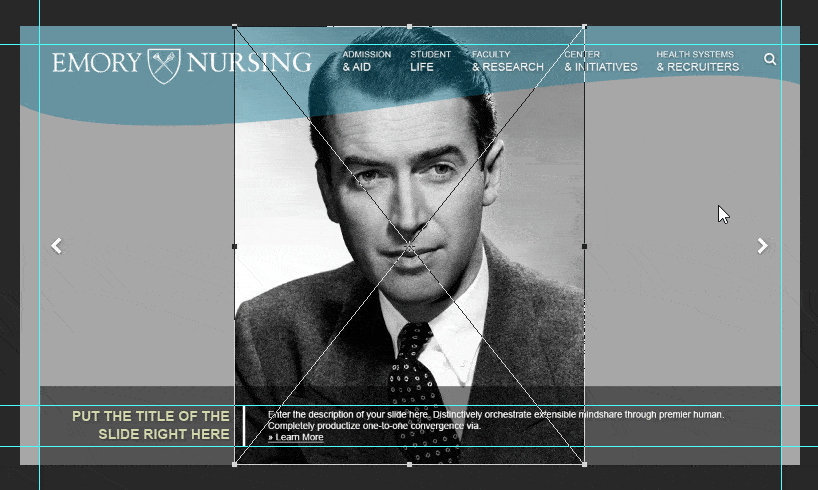
Issues with the above example:
- The majority of the top and bottom of the image is cropped out of frame
- The subject's face is too close to the viewer
3.2.C Small Images in Large Containers
Small images cannot be stretched to fill large containers. The image is stretched beyond its limits to fill the frame resulting in a significant decrease in image quality.
In the example below, the image is only 300 pixels wide and 200 pixels tall (300x200).
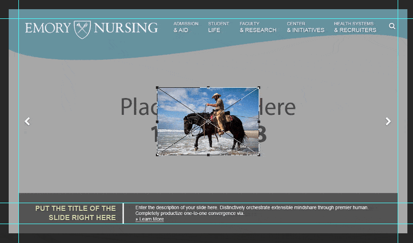
Issue with the above example:
- The image is pixelated and blurry
- Unprofessional appearance
3.2.D Alt Text
Alt text briefly describes the content of an image and is helpful to users who cannot/choose not to load images and users with limited vision.
The following example is a broken image link for which the Alt text is displayed as an image placeholder:
3.3 Hero/Opener Images
Hero or Opener images appear at the very top of a page, just below the main navigation menu. These images serve as a striking and visually impressive components meant to set the mood for the rest of the page content.
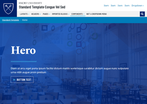
Hero/Opener Image tips
- Upload professional quality, high-resolution images. Image size requirements vary by website and page type.
- Use images that do not have text.
- Photos of buildings, skylines, landscapes, and still lifes work best in hero images. Headshots or photos of groups of people might end up being cropped inappropriately depending on the user's screen size.
3.4 Image Cropping & Optimization Tools
Generally an image should be sized to the exact specifications provided in this document before it is uploaded to Cascade. Large images can slow the loading of a page, especially for those on mobile without access to a wireless connection.
Do not upload images exceeding 2000 pixels wide.
Desktop image optimization applications
There are many applications to choose from for cropping and optimizing images. Some popular applications include:
- Adobe Photoshop - Download through Emory Software Distribution
- Affinity Photo - Store link
- GIMP - Free download link
Online image optimization applications
These websites provide free drag-and-drop bulk image file size optimization. Use one of these services before uploading images to the Cascade server to significantly reduce load times on Emory webpages.
4. Pages
4.1 Page Types
There are several types of pages to utilize, and each type has a different purpose and look.
- Interior page - Interior page demo
- Article page - Article page demo
- Landing page - Landing page demo
- Home page - Home page demo
4.1.A Interior Page
Interior pages reside one or two levels down into the sitemap, depending on the website structure.
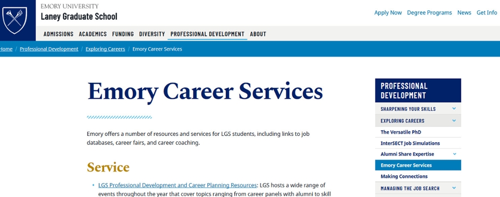
Interior page options
- Interior Hero/Opener Image - Click the file icon, navigate to the /_includes/images folder, and select an image.
All Interior page Hero/Opener images must be 2280 pixels wide and 1282 tall (2280x1282). More about Hero/Opener Images
- Lead Text - A single sentence with slightly larger text. Plain text only; 5—20 words
- WYSIWYG content - Learn more about the WYSIWYG editor
- Short Width Content Blocks
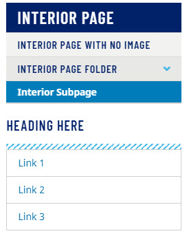
- Sidebar
- Page Navigation - Choose Auto for an automatically-generated navigation based on the current folder structure. Choose Manual to build a custom navigation or quicklinks. Choose None to omit this style of links on your sidebar.
- Link List Option - Select Yes to add additional sets of links to the sidebar.
- Build Type - For each link set, there is an option to select a pre-created block of links that can be shared on multiple pages by selecting the Block option; or a set of links specific to the page by can be entered by selecting Build in Page. To create a new link list block, use Add Content > Sidebar > Link List option.
- Sidebar Link List - Select Yes to enable
- Heading - Plain text only; 1—3 words
- Link - Link to an internal webpage, external webpage, or email address.
- Link Label - Plain text only; 1—3 words
4.1.B Article Page
These pages are timely blog or news entries one or two levels into the sitemap.
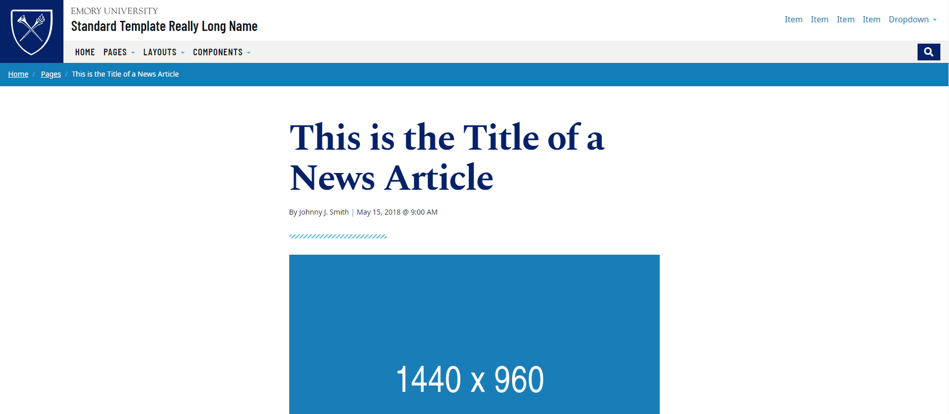
Article page options
- Interior Hero/Opener Image - Click the file icon, navigate to the /_includes/images folder, and select an image.
All Interior page Hero/Opener images must be 2280 pixels wide and 1282 tall (2280x1282). More about Hero/Opener Images
- Summary - A brief and descriptive paragraph. Plain text only; 10—40 words
- Story Image - This photo appears after the title of a news article. All Story Images must be 1440 pixels wide and 960 tall (1440x960).
- Story Image Caption - Plain text only; 5—15 words
- Article Content
- Author - Plain text only
- Date
- Caption - Plain text only; 5—15 words
- Lead Text - A single sentence with slightly larger text Plain text only; 5—20 words
- WYSIWYG content - Learn more about the WYSIWYG editor
- Related Stories - This list appears at the bottom of the page after the Article Content
- Content Type - Choose between importing an article page's content or manually entering article content.
- Manual Article Title - Plain text only; 3—8 words
- Related Story Image - Click the file icon , navigate to the /_includes/images folder, and select an image. All Related Story images must be 510 pixels wide and 287 tall (510x287px).
- Link - Link to an internal webpage, external webpage, or email address.
4.1.C Landing Page
Landing pages are generally one level into the sitemap and may feature a carousel or large hero image at the top.
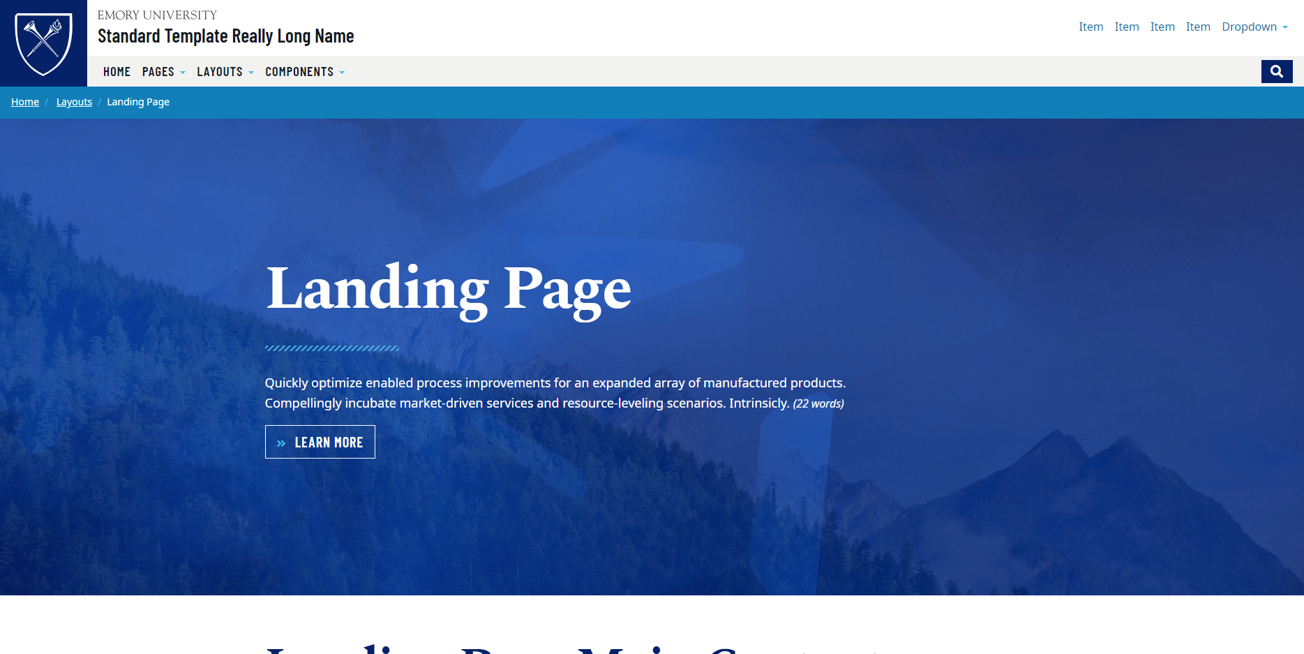
Landing page options
- Hero/Opener Image - Click the file icon , navigate to the /_includes/images folder, and select an image. All Landing page Hero/Opener images must be 1920 pixels wide and 1080 tall (1920x1080). More about Hero/Opener Images
- Layout - Choose between an image treatment with a blue overlay that allows for more text or no overlay with a shorter amount of text, or text that appears below the image in either a short-width or full-width layout.
- Heading - Plain text only; 1—3 words
- Summary - A brief and descriptive paragraph. Plain text only; 10—40 words
- Button - Buttons require a brief text label and a link to an internal webpage, external webpage, or email address.
Do not use non-descript phrases such as "Learn More" or "Click Here". - Full Width Content Blocks
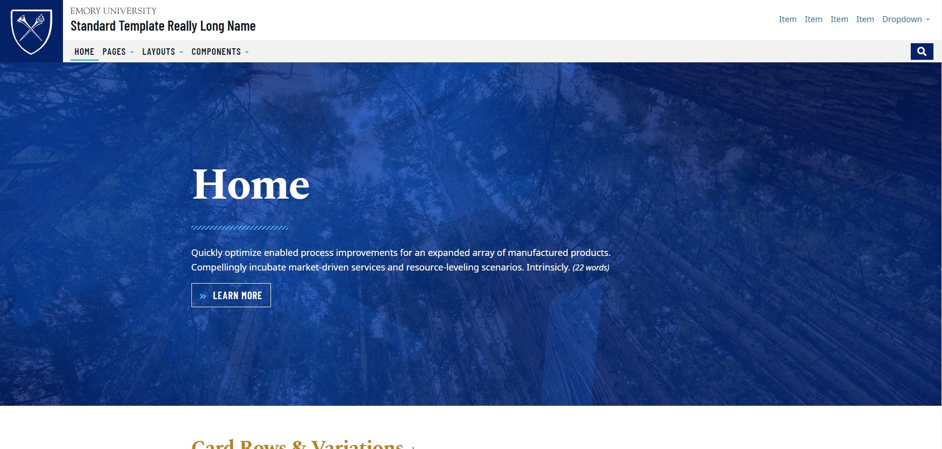
4.1.D Homepage
The Home page, also known as "index", has a Hero image or carousel spread across the top just below the main navigation and Full Width Content Blocks.
This page is laid out to help varying audiences navigate to the information they seek.
Below is a Home page with a Hero/Opener image:
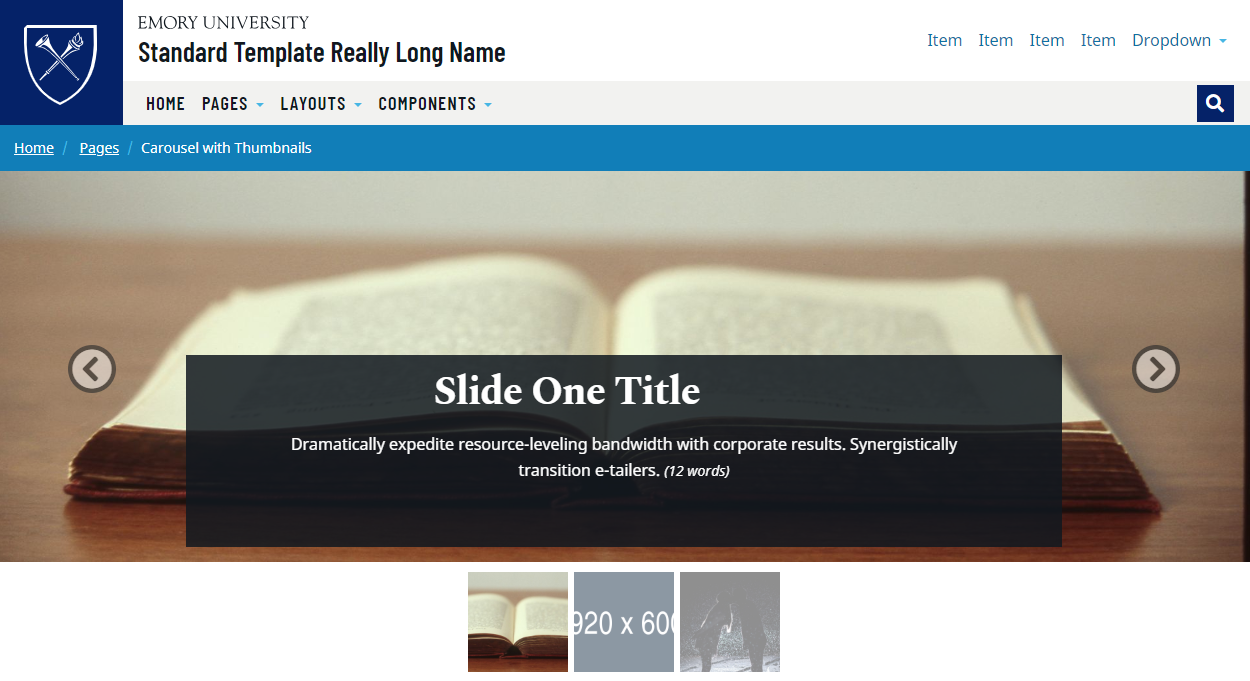
Below is a Home page with a Carousel with Thumbnail Indicators:
Home page options
The Home page can have either a static Hero/Opener image, or a rotating Carousel of images.
Option One: Hero/Opener Image
- Single Image Layout - Choose between an image treatment with a blue overlay that allows for more text or no overlay with a shorter amount of text.
- Interior Hero/Opener Image - Click the file icon , navigate to the /_includes/images folder, and select an image. All Landing page Hero/Opener images must be 1920 pixels wide and 1080 tall (1920x1080). More about Hero/Opener Images
- Heading - Plain text only; 1—3 words
- Summary - A brief and descriptive paragraph. Plain text only; 10—40 words
- Button - Buttons require a brief text label and a link to an internal webpage, external webpage, or email address.
Do not use non-descript phrases such as "Learn More" or "Click Here".
Option Two: Carousel
- Carousel - A rotating series of images with captions
- Include Thumbnails - Small, square thumbnails appear beneath the carousel, replacing the standard plain rectangle indicators
- Slide Image - Interior Hero/Opener Image - Click the file icon , navigate to the /_includes/images folder, and select an image. All Carousel Slide images must be 1920 pixels wide and 600 tall (1920x600).
- Caption Title - Plain text only; 1—8 words
- Caption Text - Plain text only; 5—15 words
- Button - Buttons require a brief text label and a link to an internal webpage, external webpage, or email address.
Do not use non-descript phrases such as "Learn More" or "Click Here". - Rearrange, Add, or Delete -
 Rearrange a section (gray up and down arrows)
 Add a section (green plus icon)
 Delete a section (red "X" icon)
4.2 Add Pages
To add one of the page types listed above (excluding the homepage), go to the Cascade menu in the top left corner of the window, then click Add Content > Pages, then select a Page Type.
Before you customize the page content, there are input fields that must be completed.
Page Name
A Page Name must be assigned to a new page, resulting in the filename.
Page Names…
- are lowercase
- contain no spaces
- contain no special characters
- separate words with dashes or underscores (e.g. emory-university-school-of-medicine)
Display Name
The Display Name field is used in several places. It is visible at the very top of the browser window inside the tab.
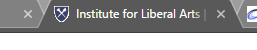
- Some browsers and search engines may display only a portion of the Display Name. The Display Name should be between 65 and 70 characters to avoid these issues.
- The Display Name is visible on the right-hand navigation of the section and page breadcrumbs.
Page Title
The Page Title appears at the top of the page.
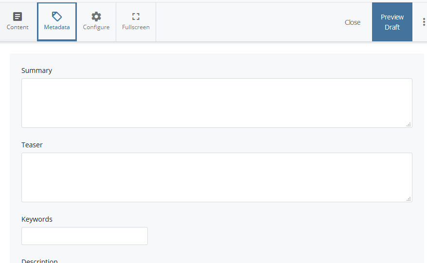
Detailed Metadata
Should you need to populate more detailed metadata, switch to the Metadata tab at the top of the page editing interface.
- Summary: The 360 character summary provides details for the Open Graph Protocol, which enables content to be richly embedded into a social media website such as Facebook or Twitter.
- Teaser: The 140 character teaser is the excerpt that is pulled into feeds across the web.
- Description: The 160 character description is shown in search engine results, such as Google or Bing.
- Alternative Title: This title will override the default title in the top of the web browser window tab.
4.3 Publish/Update Pages
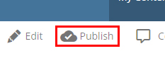
Once the content has been populated and reviewed, the next step is to publish the page(s).
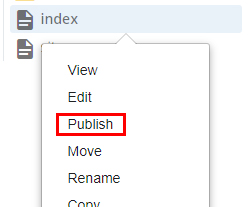
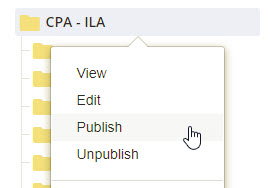
When viewing the page, click on the Publish button, or right click the page in the folder structure and choose Publish. Leave the default options as they are, then hit Submit.
Publish job queue
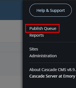
The status of a publish job can be checked using the Publish Queue.
Go to the top right menu and select Publish Queue to see the status.
To confirm the page has been published, go to the Home screen by clicking the Cascade Server logo and look under the Notifications heading for a confirmation message.
Publish related files (images and documents)
Individual pages may be published which link to an image or document. Individual files may also be manually published.
Reveal page URL
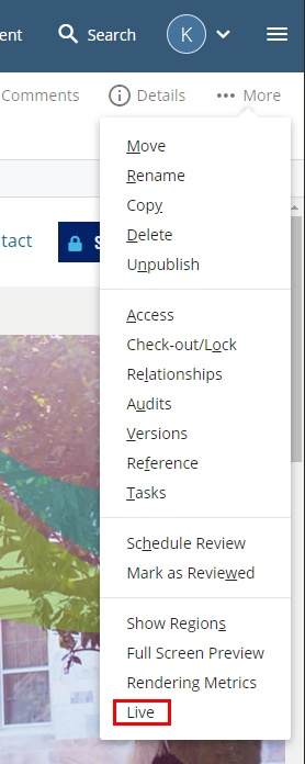
Under the More menu, click "Live" to access the live URL of the page.
4.4 Move/Rename Pages
After moving or renaming an asset, check the relationships on the page by clicking More > Relationships. If relationships to other pages exist, re-publish those items.
Consider the following before moving or renaming a page:
- Do not change the Page Name unless it is absolutely essential.
- Do not rename pages named "index". This breaks the website navigation.
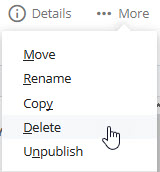
4.5 Delete Pages
Before deleting, check the relationships on the page by clicking More > Relationships. If relationships to other pages exist, change the links before deleting those items.
To delete an item, click on More > Delete.
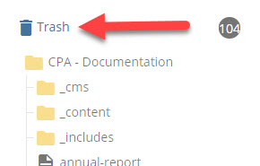
4.6 Restore Deleted Pages
Cascade pages and assets can be recovered from the Trash.
Access the Trash from the top of the document tree on the left-hand side of the Cascade window.
Navigate the table to find the item(s) to restore, check the box(es), then click the arrow icon on top left of the table:
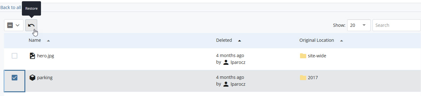
The asset(s) will immediately be restored.
4.7 Restore old version of pages
Once on a Page, Content Block, or File, click More > Versions to access the version history in the menu bar.
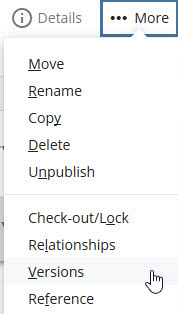
A list of version dates and authors who previously made changes will appear.
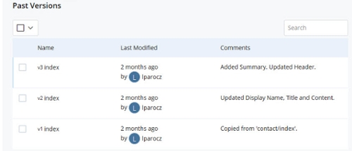
Clicking an item from the version history will reveal a preview of that content at that point in time. The menu grants several options to proceed:
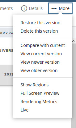
From here, a previous version can be restored.
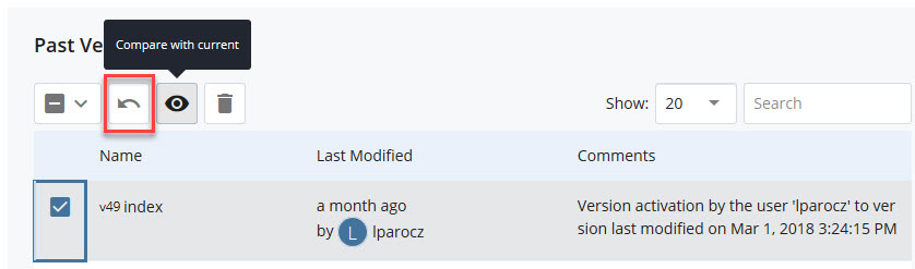
Versions can be compared in the list view by checking the checkbox next to the chosen version and clicking the backwards arrow icon or eye icon:
4.8 Organize pages and navigation
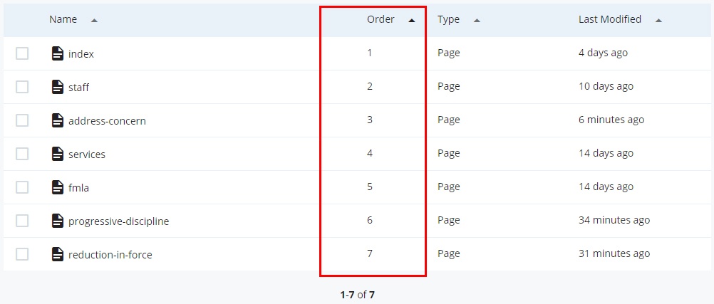
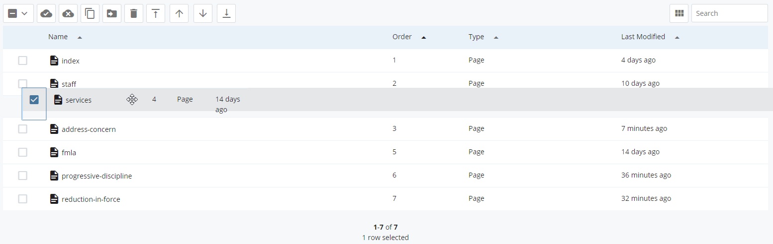
After creating a new page, it’s a good idea to check the folder order for the page. In most situations new items will be listed last, but this can be changed.
- To see the numeric order of folder contents, right click on the folder and select "view".
- In the Order column, make sure the page named index is set at position 1. If it is not at 1, move the mouse to the row that contains "index" to select it, then click on the "Move to Top" button
- To see the numeric order of folder contents, right click on the folder and select "view". Click the "Order" header to view assets by folder order rather than alphabetically.
- Drag and drop to reorder folder contents.
- Publish the entire folder to update the navigation order on all pages.
5. Content Rows
5.1 Content Row Basics
A Content Row is a section located in the main content of a page that contains Content Blocks which make up the individual components on a page, such as:
- Accordions
- Card Lists and Card Decks
- Embedded Media
- Quotes
- …and more
While editing a page, scroll down to view the Content Row section. Here you will see a green "plus" , a red "x" , and arrows .
5.2 Add Content Rows
Click the green "plus" to add a new Content Row.
5.3 Rearrange Content Rows
Use the up and down arrows to move the Content Rows around.
5.4 Delete Content Rows
Click the red "x" to delete a Content Row.
6. Content Blocks
6.1 Content Block Basics
Content Blocks are custom reusable components that can be assigned to one or more Content Rows on a page.
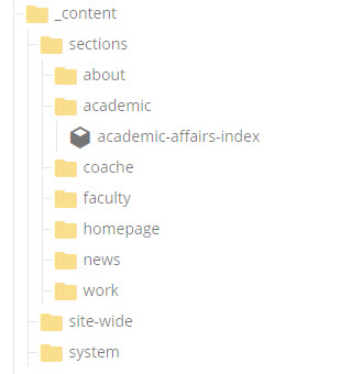
Content blocks are located in the _content folder and are typically organized into sections.
Content Block availability can differ between Page Types.
6.2 Add Content Blocks
To create a new Content Block, click Add Content > Blocks and choose the desired type.
6.3 Links in Content Blocks
Cascade Page or File
These internal link types send the reader to another part of your Cascade site.
To link to an internal page or file that exists in Cascade, select the text to link and click on the Link icon:
Click Cascade Page, or Cascade File, then navigate to the page or document to be linked to.
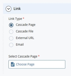
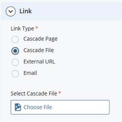
There are two options for linking internal assets…
- choose an asset that was recently referenced from a list, or
- browse through all available assets.
The Recent assets tab is selected by default.
- Click on the Browse tab in order to bring up the asset browser:
- Select a link by clicking on the radio button (gray circle) to the left.
- Once the link is selected, click Choose in the top right corner.
- Last, insert the link with the bottom right Ok button:
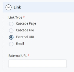
External Link
An external link will send the user to a different website than the one they're currently on.
Choose External, then paste in the full URL.
Choose the Email option. In the address box, specify the email address and optionally the email subject.
6.4 Types of Content Blocks
6.4.A Accessible Chart
Accessible Charts offer a way to show a labeled image and add the content of the image for readability and accessibility.
Accessible Chart Options
- Heading - This is the descriptive title that appears above the Content Block. Plain text only; 1—10 words
- ARIA Label - If a Heading is not used, this hidden accessible title must be used instead.
Use descriptive labels. Instead of "Getting to Campus", use "Getting to Oxford College Campus"
Plain text only; 1—10 words
Do not use multiple identical ARIA Labels or Headings on a page. - Summary - A brief and descriptive paragraph. Plain text only; 10—40 words
- Image Layout: Choose between a half width image aligned to the right or left of the text or a full-width image appearing above the text.
- Accessible Chart Images must be a minimum of 300 pixels wide. Alt text must be entered for accessibility.
- Title - Plain text only; 5-7 words
- WYSIWYG content - Learn more about the WYSIWYG editor
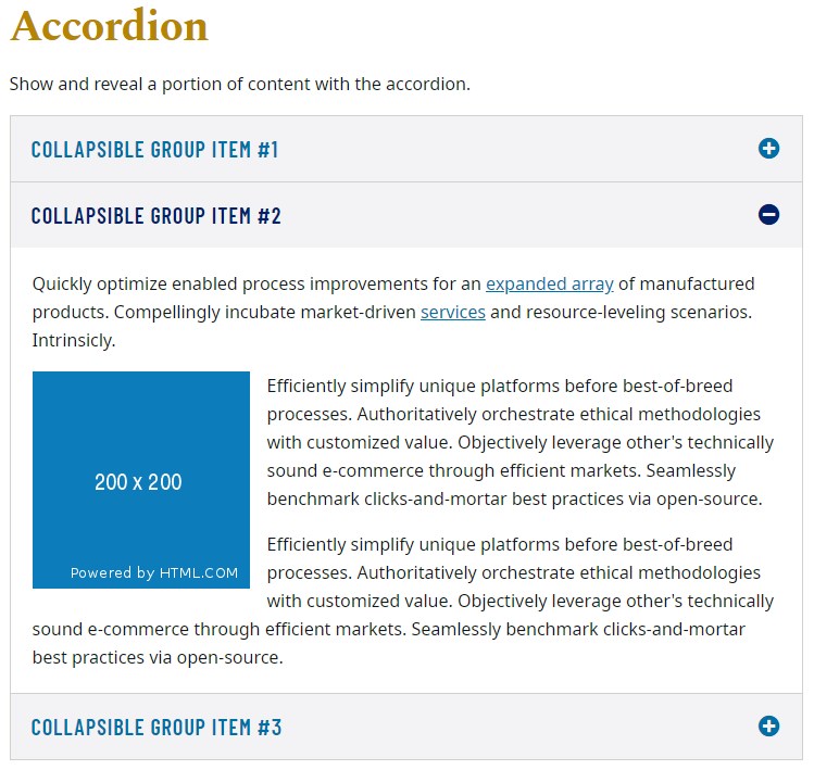
6.4.B Accordion
Accordions are interactive components that organize related information, text, and images in a collapsible and expandable interface.
Accordion Options
- Heading - This is the descriptive title that appears above the Content Block. Plain text only; 1—10 words
- ARIA Label - If a Heading is not used, this hidden accessible title must be used instead.
Use descriptive labels. Instead of "Getting to Campus", use "Getting to Oxford College Campus"
Plain text only; 1—10 words
Do not use multiple identical ARIA Labels or Headings on a page. - Summary - A brief and descriptive paragraph. Plain text only; 10—40 words
- Accordion Section -
- Heading - Plain text only; 1—10 words
- WYSIWYG content - Learn more about the WYSIWYG editor
- Rearrange, Add, or Delete -
- Rearrange a section (gray up and down arrows)
- Add a section (green plus icon)
- Delete a section (red "X" icon)
6.4.C Alternating Image Row
Alternating Image Rows contain a small image, brief accompanying text, and a button link. Each item added will alternate the text and image location from left to right.
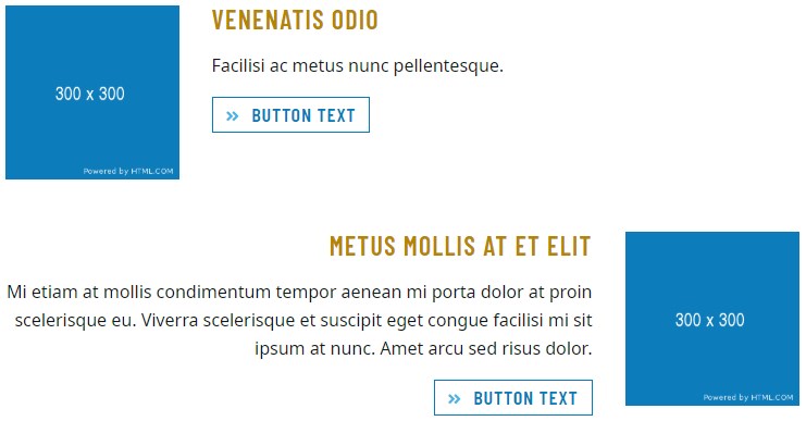
Alternating Image Row Options
- Heading - This is the descriptive title that appears above the Content Block. Plain text only; 1—10 words
- ARIA Label - If a Heading is not used, this hidden accessible title must be used instead.
Use descriptive labels. Instead of "Getting to Campus", use "Getting to Oxford College Campus"
Plain text only; 1—10 words
Do not use multiple identical ARIA Labels or Headings on a page. - Summary - A brief and descriptive paragraph. Plain text only; 10—40 words
- Alternating Image Row Item -
- Alternating Image Row Images must be a minimum of 300 pixels wide. Alt text must be entered for accessibility.
- Heading - This is the capitalized text that accompanies each item. Plain text only; 1—10 words
- Summary - A brief and descriptive paragraph. Plain text only; 10—40 words
- Button - Buttons require a brief text label and a link to an internal webpage, external webpage, or email address.
Do not use non-descript phrases such as "Learn More" or "Click Here".
- Rearrange, Add, or Delete -
- Rearrange a section (gray up and down arrows)
- Add a section (green plus icon)
- Delete a section (red "X" icon)
6.4.D Bio Cards
Bio cards are wrapped in a light gray border. Within, the left column is used to display a vertical portrait photo. In the right column, blocks of text show the name, roles, contact information, and a brief biographical paragraph.
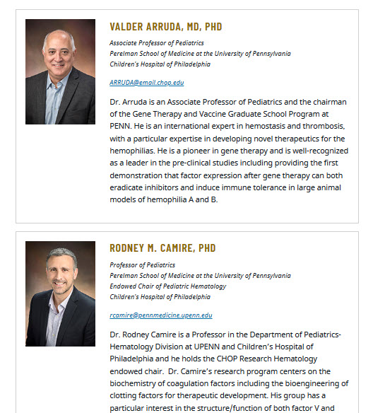
Bio Card Options
- Heading - This is the descript title that appears above the Content Block. Plain text only; 1—3 words
- ARIA Label - If a Heading is not used, this hidden accessible title must be used instead. Use descript labels. Instead of "Getting to Campus", use "Getting to Oxford College Campus" Plain text only; 1—10 words
Do not use multiple identical ARIA Labels or Headings on a page. - Summary - A brief and descriptive paragraph. Plain text only; 10—40 words
- Per Card -
- Bio Card Images must be 200 pixels wide and 250 pixels tall (200x250px) Alt text must be entered for accessibility.
- Name
- Email - Enter a valid email address.
- Phone - Use the format XXX-XXX-XXXX.
Do not enter strings of text - only enter a phone number. - Role(s)
- Summary - A brief and descriptive paragraph.10—40 words
- Button - Buttons require a brief text label and a link to an internal webpage, external webpage, or email address.
Do not use non-descript phrases such as "Learn More" or "Click Here". - Rearrange, Add, or Delete -
- Rearrange a section (gray up and down arrows)
- Add a section (green plus icon)
- Delete a section (red "X" icon)
6.4.E Callout Card
Each card in this row functions as large image link buttons.
Callout Card Options
- Heading - This is the descriptive title that appears above the Content Block. Plain text only; 1—10 words
- ARIA Label - If a Heading is not used, this hidden accessible title must be used instead.
Use descriptive labels. Instead of "Getting to Campus", use "Getting to Oxford College Campus"
Plain text only; 1—10 words
Do not use multiple identical ARIA Labels or Headings on a page. - Summary - A brief and descriptive paragraph. Plain text only; 10—40 words
- Per Card -
- Callout Card Images must be a minimum of 300 pixels wide. Alt text must be entered for accessibility.
- Title - Plain text only; 1—5 words
- Button - Buttons require a brief text label and a link to an internal webpage, external webpage, or email address.
Do not use non-descript phrases such as "Learn More" or "Click Here". - Rearrange, Add, or Delete -
- Rearrange a section (gray up and down arrows)
- Add a section (green plus icon)
- Delete a section (red "X" icon)
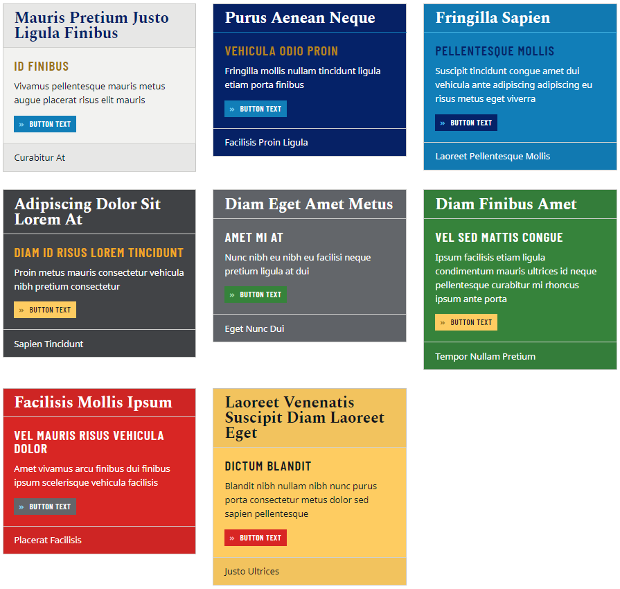
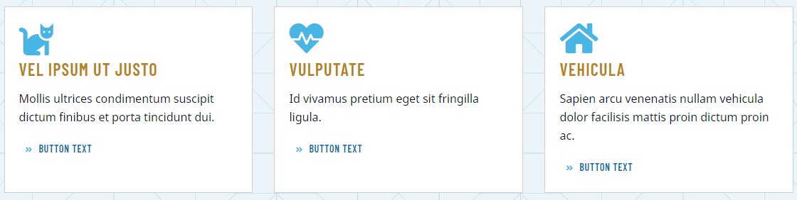
6.4.F Card Deck
Card Decks are visually interesting components that organize several topics into contained blocks. These can contain a brief text description, thumbnail image, and button links. Cards can vary by size, shape, and color.
Card Deck Options
- Heading - This is the descriptive title that appears above the Content Block. Plain text only; 1—10 words
- ARIA Label - If a Heading is not used, this hidden accessible title must be used instead.
Use descriptive labels. Instead of "Getting to Campus", use "Getting to Oxford College Campus"
Plain text only; 1—10 words
Do not use multiple identical ARIA Labels or Headings on a page. - Summary - A brief and descriptive paragraph. Plain text only; 10—40 words
- Background Color - Choose between the different color options
- Per Card -
- Card Elements - Choose components to include on all cards.
- Style - Styles can be changed per card. See screenshot above for style examples.
- Card Deck Images must be 600 pixels wide and 339 pixels tall (600x339px) Alt text must be entered for accessibility.
- Subhead - Plain text only; 1—5 words
- Summary - A brief and descriptive sentence. Plain text only; 5—15 words
- Button - Buttons require a brief text label and a link to an internal webpage, external webpage, or email address.
Do not use non-descript phrases such as "Learn More" or "Click Here". - Rearrange, Add, or Delete -
- Rearrange a section (gray up and down arrows)
- Add a section (green plus icon)
- Delete a section (red "X" icon)
6.4.G Card List
Cards Lists are cards that have lists of items or links within.
Card List Options
- Heading - This is the descriptive title that appears above the Content Block. Plain text only; 1—10 words
- ARIA Label - If a Heading is not used, this hidden accessible title must be used instead.
Use descriptive labels. Instead of "Getting to Campus", use "Getting to Oxford College Campus"
Plain text only; 1—10 words
Do not use multiple identical ARIA Labels or Headings on a page. - Summary - A brief and descriptive paragraph. Plain text only; 10—40 words
- Per Card -
- Card Elements - Choose components to include on all cards.
- Style - Styles can be changed per card.
- Card List Images must be 600 pixels wide and 339 pixels tall (600x339px) Alt text must be entered for accessibility.
- Subhead - Plain text only; 1—5 words
- Summary - A brief and descriptive sentence. Plain text only; 5—15 words
- Button - Buttons require a brief text label and a link to an internal webpage, external webpage, or email address.
Do not use non-descript phrases such as "Learn More" or "Click Here". - Rearrange, Add, or Delete -
- Rearrange a section (gray up and down arrows)
- Add a section (green plus icon)
- Delete a section (red "X" icon)
6.4.H Two-Column Cards
These cards contain a floated image to the left of some text.
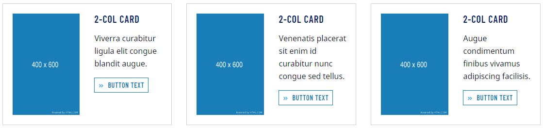
Two-Column Card Options
- Heading - This is the descript title that appears above the Content Block. Plain text only; 1—3 words
- ARIA Label - If a Heading is not used, this hidden accessible title must be used instead. Use descript labels. Instead of "Getting to Campus", use "Getting to Oxford College Campus" Plain text only; 1—10 words
Do not use multiple identical ARIA Labels or Headings on a page. - Summary - A brief and descriptive paragraph. Plain text only; 10—40 words
- Per Card -
- Two-Column Card Images must be 200 pixels wide and 250 pixels tall (200x250px) Alt text must be entered for accessibility.
- Heading - Plain text only; 1—5 words
- Summary - A brief and descriptive sentence. Plain text only; 5—15 words
- Button - Buttons require a brief text label and a link to an internal webpage, external webpage, or email address.
Do not use non-descript phrases such as "Learn More" or "Click Here". - Rearrange, Add, or Delete -
- Rearrange a section (gray up and down arrows)
- Add a section (green plus icon)
- Delete a section (red "X" icon)
6.4.I Full Width Carousel
Full-width Carousels are visually striking animated components that are available on Home and Landing pages. These function as a slideshow and use high-quality photos, optional captions, and optional button links.
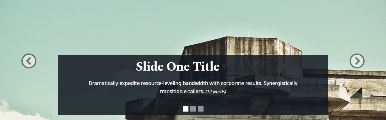
Full Width Carousel Options
- Heading - This is the descriptive title that appears above the Content Block. Plain text only; 1—10 words
- ARIA Label - If a Heading is not used, this hidden accessible title must be used instead.
Use descriptive labels. Instead of "Getting to Campus", use "Getting to Oxford College Campus"
Plain text only; 1—10 words
Do not use multiple identical ARIA Labels or Headings on a page. - Summary - A brief and descriptive paragraph. Plain text only; 10—40 words
- Include Thumbs - Include small thumbnail images of each slide below the carousel.
- Carousel Slides -
- Full Width Carousel Images must be 1920 pixels wide and 600 pixels tall (1920x600px) Alt text must be entered for accessibility.
Caption Title - Plain text only; 1—8 words
Caption Text - Plain text only; 5—15 words
- Button - Buttons require a brief text label and a link to an internal webpage, external webpage, or email address.
Do not use non-descript phrases such as "Learn More" or "Click Here".
- Rearrange, Add, or Delete -
- Rearrange a section (gray up and down arrows)
- Add a section (green plus icon)
- Delete a section (red "X" icon)
6.4.J Interior Page Carousel
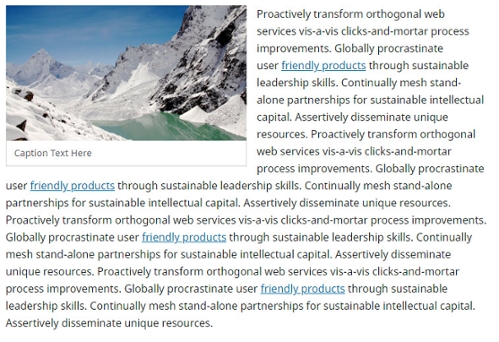
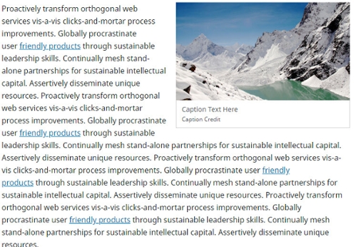
Interior Page Carousels are animated components that supplement page content using high-quality photos and descriptive captions.
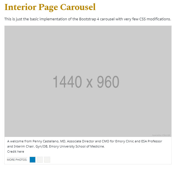
Interior Page Carousel Options
- Heading - This is the descriptive title that appears above the Content Block. Plain text only; 1—10 words
- ARIA Label - If a Heading is not used, this hidden accessible title must be used instead.
Use descriptive labels. Instead of "Getting to Campus", use "Getting to Oxford College Campus"
Plain text only; 1—10 words
Do not use multiple identical ARIA Labels or Headings on a page. - Summary - A brief and descriptive paragraph. Plain text only; 10—40 words
- Include Thumbs - Include small thumbnail images of each slide below the carousel.
- Carousel Slides -
- Interior Page Carousel Images must be 1440 pixels wide and 960 pixels tall (1440x960px) Alt text must be entered for accessibility.
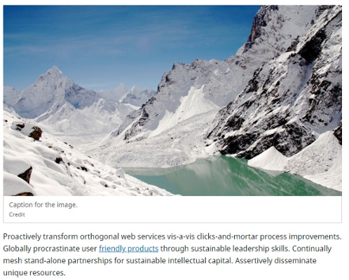
Caption Text - Plain text only; 5—15 words
Caption Credit - Optional credit to the photographer
- Rearrange, Add, or Delete -
- Rearrange a section (gray up and down arrows)
- Add a section (green plus icon)
- Delete a section (red "X" icon)
6.4.K Contact Block
Using a Contact Block is an optimal way to organize contact information about a person or organization.
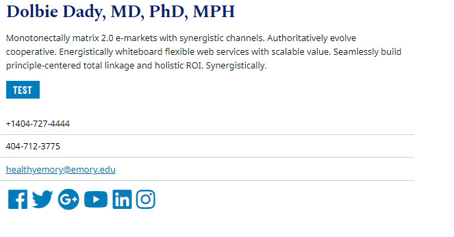
Contact Block Options
- Heading - This is the descriptive title that appears above the Content Block. Plain text only; 1—10 words
- ARIA Label - If a Heading is not used, this hidden accessible title must be used instead.
Use descriptive labels. Instead of "Getting to Campus", use "Getting to Oxford College Campus"
Plain text only; 1—10 words
Do not use multiple identical ARIA Labels or Headings on a page. - Summary - A brief and descriptive paragraph. Plain text only; 10—40 words
- Contact Group -
- Name - A caption title and brief text can be added. Plain text only
- Summary - A brief and descriptive paragraph. Plain text only; max 150 characters
- Include Field Labels - Adds labels such as "Address" or "Email" in the left column
- Button - Buttons require a brief text label and a link to an internal webpage, external webpage, or email address.
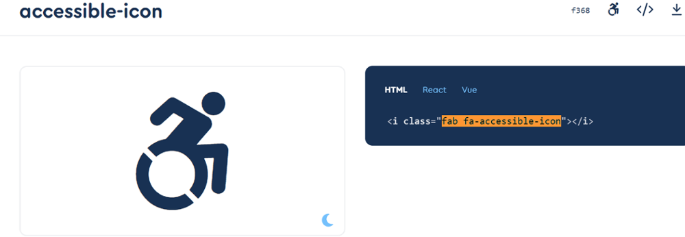
Do not use non-descript phrases such as "Learn More" or "Click Here".Icon - Select an icon from the Font Awesome repository, click to reveal the icon code, and copy/paste the icon code (e.g. fab fa-accessible-icon) into the textbox
- Fields -
- Label - Very brief plain text Plain text only; max 50 characters
Rich Text content WYSIWYG- Basic text formatting such as bold and italic text
- Address - Enter one or multiple lines of an address. Links to Google Maps or Mapquest are accepted.
- Email - Enter a valid email address.
- Phone - Use the format XXX-XXX-XXXX.
Do not enter strings of text - only enter a phone number. - Social Media - Enter links for Facebook, Twitter, Youtube, Linkedin, or Instagram, starting with "https://".
- Rearrange, Add, or Delete -
- Rearrange a section (gray up and down arrows)
- Add a section (green plus icon)
- Delete a section (red "X" icon)
6.4.L Icon Row
Icon Rows contain a large blue icon in the top left corner, and brief descriptive text and optional link. The presence of iconography can quickly guide users to their desired content such as contact information, documents, a Log In page, and more, if used properly.
Icon Row Options
- Heading - This is the descriptive title that appears above the Content Block. Plain text only; 1—10 words
- ARIA Label - If a Heading is not used, this hidden accessible title must be used instead.
Use descriptive labels. Instead of "Getting to Campus", use "Getting to Oxford College Campus"
Plain text only; 1—10 words
Do not use multiple identical ARIA Labels or Headings on a page. - Summary - A brief and descriptive paragraph. Plain text only; 10—40 words
Icon - Select an icon from the Font Awesome repository, click to reveal the icon code, and copy/paste the icon code (e.g. fab fa-accessible-icon) into the textbox
- Button - Buttons require a brief text label and a link to an internal webpage, external webpage, or email address.
Do not use non-descript phrases such as "Learn More" or "Click Here". - Rearrange, Add, or Delete -
- Rearrange a section (gray up and down arrows)
- Add a section (green plus icon)
- Delete a section (red "X" icon)
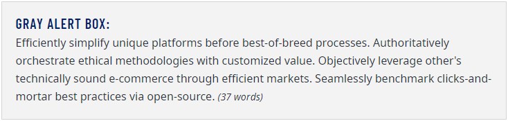
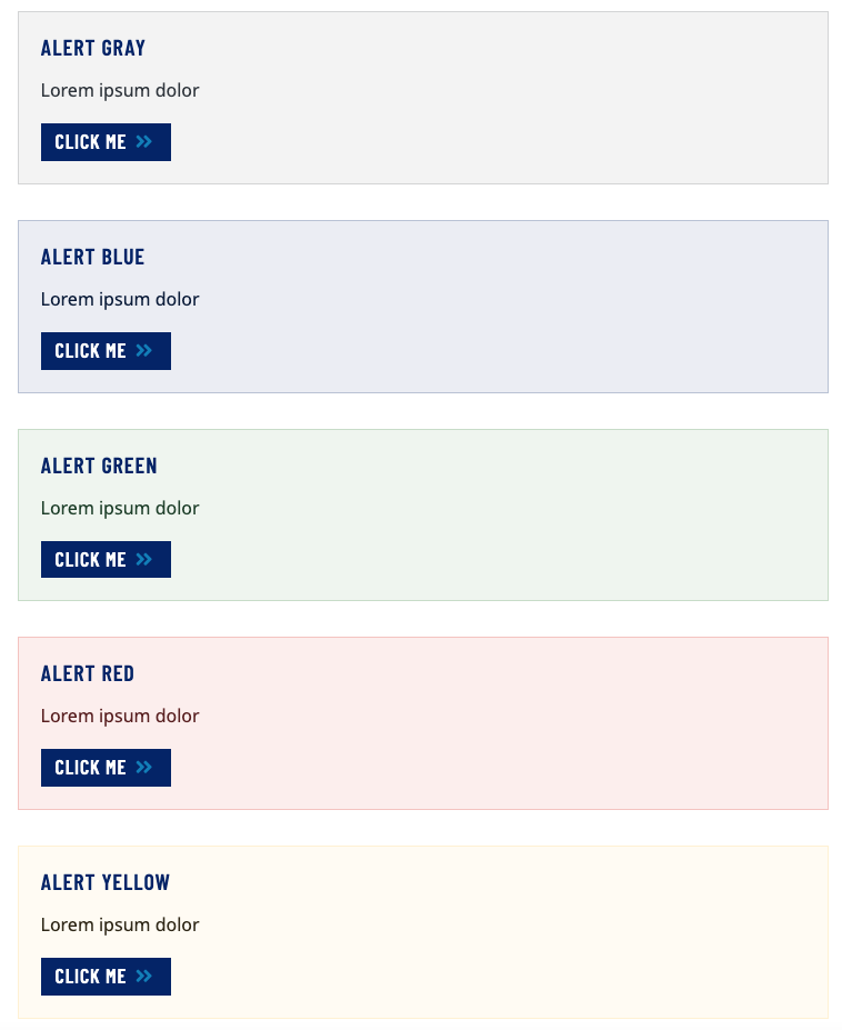
6.4.M Info Box
An Info Box should contain supplemental information, such as a useful tip or warning about the current subject matter.
Info Box Options
- Heading - This is the descriptive title that appears above the Content Block. Plain text only; 1—10 words
- ARIA Label - If a Heading is not used, this hidden accessible title must be used instead.
Use descriptive labels. Instead of "Getting to Campus", use "Getting to Oxford College Campus"
Plain text only; 1—10 words
Do not use multiple identical ARIA Labels or Headings on a page.
- Background Color - "Geometric" options will now just be the background color. The geometric grid is being removed from this template as of December 2023.
- - Options available such as:
- gray
- blue
- green
- yellow
- red
- gray geometric
- Emory blue geometric
- Emory secondary blue geometric
- dark green geometric
- gold geometric
- red geometric
- - Options available such as:
Rich Text content WYSIWYG- Basic text formatting such as bold and italic text
- Button - Buttons require a brief text label and a link to an internal webpage, external webpage, or email address.
Do not use non-descript phrases such as "Learn More" or "Click Here".
Example of different background color options of the info box:
6.4.N Jumbo
Jumbos are an impactful way to highlight a person, event, location, or idea on a page.
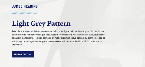
Jumbo Options
- Heading - This is the descriptive title that appears above the Content Block. Plain text only; 1—10 words
- ARIA Label - If a Heading is not used, this hidden accessible title must be used instead.
Use descriptive labels. Instead of "Getting to Campus", use "Getting to Oxford College Campus"
Plain text only; 1—10 words
Do not use multiple identical ARIA Labels or Headings on a page. - Summary - A brief and descriptive paragraph. Plain text only; 10—40 words
- Background Color - NOTE: "Geometric" options will now just be the background color. The geometric grid is being removed from this template as of December 2023
- Jumbo Images must be 300 pixels wide and 300 pixels tall (300x300px) Alt text must be entered for accessibility.
- Subheading - This text is larger than the primary Heading and appears above the WYSIWYG content. Plain text only; 1—10 words
- WYSIWYG content - Learn more about the WYSIWYG editor
- Button - Buttons require a brief text label and a link to an internal webpage, external webpage, or email address.
Do not use non-descript phrases such as "Learn More" or "Click Here".
6.4.O Media Embed
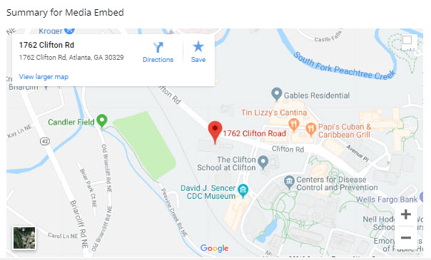
Embedding third-party content such as Google Maps or YouTube videos on a page is possible with a Media Embed.
Media Embed Options
- Heading - This is the descriptive title that appears above the Content Block. Plain text only; 1—10 words
- ARIA Label - If a Heading is not used, this hidden accessible title must be used instead.
Use descriptive labels. Instead of "Getting to Campus", use "Getting to Oxford College Campus"
Plain text only; 1—10 words
Do not use multiple identical ARIA Labels or Headings on a page. - Summary - A brief and descriptive paragraph. Plain text only; 10—40 words
- Media Title - Enter a title for the media item. This is an accessibility requirement. Plain text only; 1—10 words
- Embed Types -
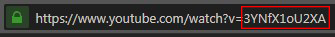
- YouTube ID - Found in the video URL immediately following the "=" character
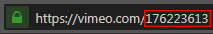
- Vimeo ID - Found in the video URL immediately following ".com/"
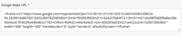
- Google Maps embed - Click the Share icon on the map. Select "Embed a Map", then "Copy HTML".
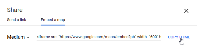
- Paste this markup into the Cascade field.
- Smugmug Slideshow URL - Smugmug account required.
Select an album, click a photo to view it, then click the "Share" icon at the top right corner of the screen.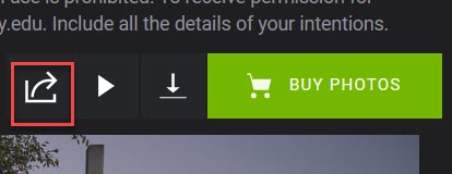
On the Share popup, select "Copy Gallery Link" and paste into the Smugmug Slideshow URL field.
To include a button link to the full album, check "Yes" next to "Button Link to Album?". Copy the Gallery Link to the URL field.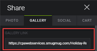
6.4.P News Feed
News Feeds display the latest blog or article posts, with a heading thumbnail images, and a button to view all news.
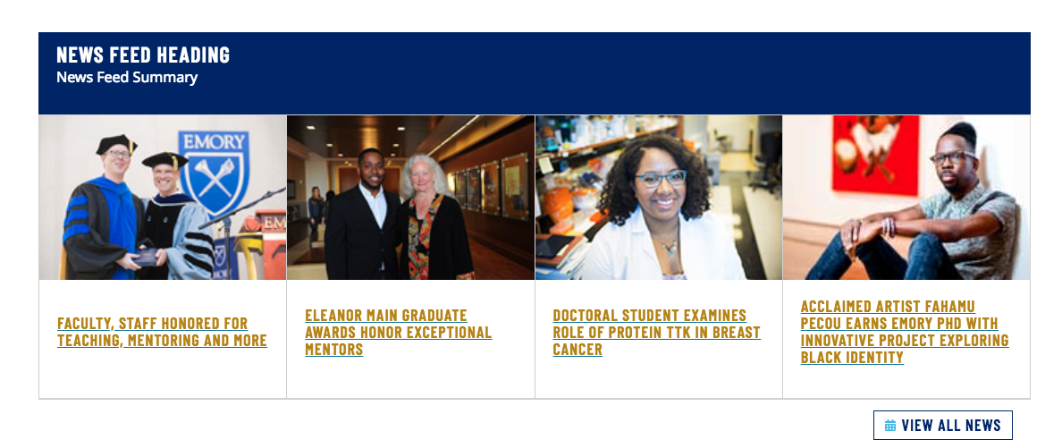
News Feed Options
- Heading - This is the descriptive title that appears above the Content Block. Plain text only; 1—10 words
- ARIA Label - If a Heading is not used, this hidden accessible title must be used instead.
Use descriptive labels. Instead of "Getting to Campus", use "Getting to Oxford College Campus"
Plain text only; 1—10 words
Do not use multiple identical ARIA Labels or Headings on a page. - Summary - A brief and descriptive paragraph. Plain text only; 10—40 words
- Feed URL - Enter the feed URL from the list of available feeds.
High resolution thumbnails must be used to display the feed correctly. Contact the CPA Web Group for more information. You my be able to utilize other RSS or ATOM feeds, but these are not tested or validated and may exhibit unusual behaviors. - Link - Link to an internal webpage, external webpage, or email address.
6.4.Q Quote
Use a Quote when quoting a person or institution. The Quote option not only improves SEO but also makes the quote text stand out in a striking manner.
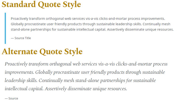
Quote options
- Style - Choose Standard for a blockquote-style quote with smaller text, or Alternative for larger, italicized text.
- Quote - A brief paragraph Plain text only; 5—30 words
- Attribution - A very brief citation in plain-text Plain text only; 1—10 words
6.4.R Stat Columns
Stat Columns display large figures with a descriptive snippet underneath.
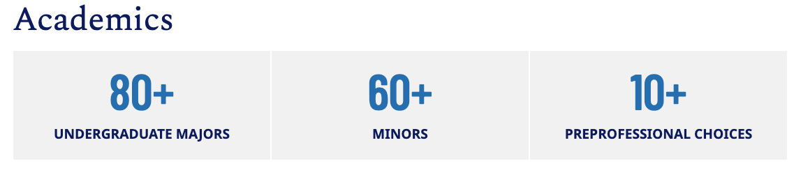
Stat Column Options
- Heading - This is the descriptive title that appears above the Content Block. Plain text only; 1—10 words
- ARIA Label - If a Heading is not used, this hidden accessible title must be used instead.
Use descriptive labels. Instead of "Getting to Campus", use "Getting to Oxford College Campus"
Plain text only; 1—10 words
Do not use multiple identical ARIA Labels or Headings on a page. - Summary - A brief and descriptive paragraph. Plain text only; 10—40 words
- Statistic - Multiples allowed, two to three recommended.
- Number - Plain text only; 10—40 words
- Text Snippet - Plain text only;10—40 words
6.4.S Trumba
Automatically pull in events from a Trumba Calendar, displaying the event name and date.
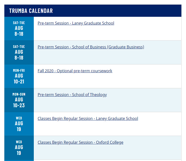
Trumba Options
- Heading - This is the descriptive title that appears above the Content Block. Plain text only; 1—10 words
- ARIA Label - If a Heading is not used, this hidden accessible title must be used instead.
Use descriptive labels. Instead of "Getting to Campus", use "Getting to Oxford College Campus"
Plain text only; 1—10 words
Do not use multiple identical ARIA Labels or Headings on a page. - Summary - A brief and descriptive paragraph. Plain text only; 10—40 words
- Calendar Name -
When signed in to a Trumba account, click the Publish button.
The Calendar Name appears next to the Unique web name field under the Publish Settings interface.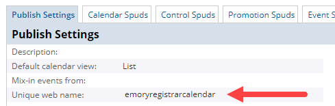
The Calendar Name can also be found at the end of the calendar's Trumba URL.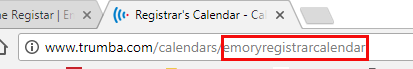
- Number of Events - Display up to 8 events
6.5 Assign Content Blocks
A Content Row must be created before a Content Block can be assigned to it.
- In the Content Row, click Choose Block to bring up the folder browser
- Navigate to the desired Content Block and click Choose
- Submit any desired changes
6.5.A Content Block & Content Row Compatibility
Some Content Blocks may only be placed in either Full-width or Short-width Content Rows.
| Content Block | Content Row | |
|---|---|---|
| Full-width | Short-width | |
| Accordion | ||
| Alternating Image Row | ||
| Callout Card Row | ||
| Card Deck | ||
| Card List | ||
| Full-width Carousel | ||
| Interior Page Carousel | ||
| Contact Block | ||
| Icon Row | ||
| Info Block | ||
| Jumbo | ||
| Media Embed | ||
| News Feed | ||
| Quote - Standard Style | ||
| Quote - Alternative Style | ||
| Trumba Row | ||
| Two-column Card Row | ||
6.6 Publishing Content Blocks
Rather than publishing individual Content Blocks, Pages containing those Content Blocks must be published in order for the assigned Content Blocks to appear.
Relationships
To determine which pages the Content Blocks are assigned to, use the Relationships tool.
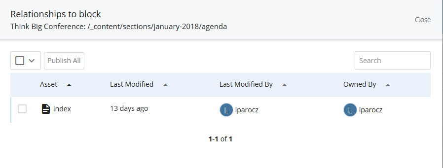
- Navigate to the Content Block to be published
- Click More > Relationships in the top right corner
- Check off individual pages or click Publish All to publish/update the related pages
7. Site-Wide Elements
7.1 Header and Navigation
The Header is located at the top of every page on the website and contains customizable main navigation.
The left side contains mandatory Emory University branding, the site name, and main navigation. On the right is optional auxiliary navigation and mandatory search bar.
Customize main navigation
Edit the Navigation Block at /_content/sitewide/navigation.
- Label - Enter a short name for the navigation item
- Link - Link to an internal webpage, external webpage, or email address.
- Rearrange, Add, or Delete -
- Rearrange a section (gray up and down arrows)
- Add a section (green plus icon)
- Delete a section (red "X" icon)
Publish changes to Header Navigation
The entire website must be published in order to update the Header Navigation on each page. Right click on the base or topmost folder (name of website) and click Publish.

7.2 Footer Elements
The Footer is located at the bottom of every page on the website and contains customizable components such as contact information, social media links, and icon links.
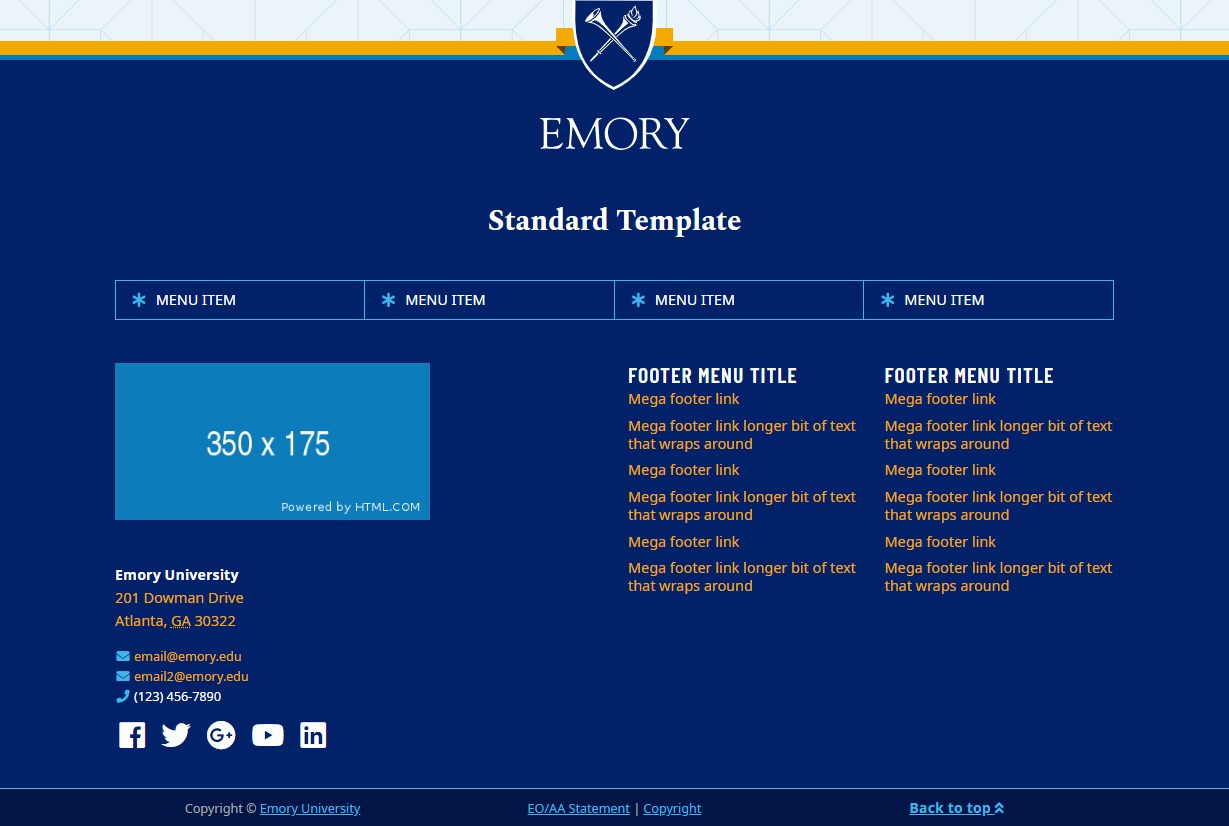
At the top of the footer is the Emory University shield logo. Beneath that is the site name.
Next there is a row of Icon Links that span the width of the Footer.
Below in the left column is a logo or unit signature. The official Emory unit signature element is restricted and may only be assigned by Communications and Public Affairs.
Beneath the logo is an address, contact information, and social media links.
The second and third columns may contain custom Menu Navigation Links.
Last, spanning the width of the bottom is the Post Footer which contains Emory University copyright information and a link to jump to the top of the webpage. The Post Footer cannot be modified.
Customize Footer elements
Edit the Footer Block at /_content/sitewide/footer.
- Site Title - Enter the title of the organization. Plain text only; 1—6 words
- Contact Information - Optional address, phone, fax, and email fields
- Social Media - Enter links for Facebook, Twitter, X, Google+, Youtube, Linkedin, Instagram, or TikTok, starting with "https://".
- Footer - The Footer contains a placeholder image when a website is first created. The official Emory unit signature element is restricted and may only be assigned by Communications and Public Affairs. Please contact CPA for assistance prior to launching a website.
- Icon Links -
Icon - Select an icon from the Font Awesome repository, click to reveal the icon code, and copy/paste the icon code (e.g. fab fa-accessible-icon) into the textbox
- Label - Enter a short name for the menu item
- Link - Link to an internal webpage, external webpage, or email address.
- Menu Navigation Links -
- Label - Enter a short name for the menu item
- Link - Link to an internal webpage, external webpage, or email address.
- Rearrange, Add, or Delete -
- Rearrange a section (gray up and down arrows)
- Add a section (green plus icon)
- Delete a section (red "X" icon)
Publish changes to Footer elements
The entire website must be published in order to update the Footer elements on each page. Right click on the base or topmost folder (name of website) and click Publish.
7.3 Sections/Directories
New website sections or directories can be added and managed in Cascade.
- Create new folder - Click Add Content > Folder in the top left corner of the browser window.
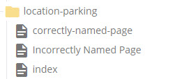
- Provide folder name - Folder names must…
- be lowercase, and
- contain no spaces, and
- contain no special characters, and
- separate words with dashes or underscores.
- Incorrect: Incorrectly Named Folder
Correct: correctly-named-folder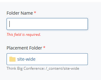
- Add an "index" page -
- Click Add Content in the top left corner of the browser window and select a Page Type
- Set Page Name to "index"
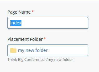
- Set Placement Folder to the new folder
- Click Submit in the bottom right.
8. Accessibility
8.1 About WCAG & accessibility resources
Emory University Digital Strategy and Design strives to conform to WCAG 2.0 accessibility standards at the AA level. In order to achieve this level of accessibility, the SiteImprove suite is employed on a regular basis to automatically check for errors. However, not every accessibility issue can be detected automatically - content editors and web developers should work together to make websites as compliant as possible.
Accessibility Resources
- Introduction to Accessibility
- The Importance Of Web Accessibility And How Marketers Can Help
- 3 Reasons Readability Should Matter to Content Editors
8.2 Buttons, Links and URLs
8.2.A Button Link Text
Often a button or link will be written out with text that says "Learn More", "Click Here", "Continue Reading", and other similar vague text.
Incorrect button & link text:
Learn MoreClick Here
Using vague text in this way is not useful to those who are scanning for links on a webpage, especially for those using assistive technologies.
Correct button & link text:
Learn More about our coursesGo to our store page
Download the comparison chart (PDF)
These examples use specific wording which helps the user to determine exactly what will happen when they click the button or link.
Ensure button & link accessibility
- Use verbs to describe the action ("go", read", "download", "toggle" etc.).
- Use nouns to define who, where, or what the link is referring to.
8.2.B URLs Within Text
It is common to place URLs or links inside blocks of WYSIWYG text. In order to maintain text simplicity, legibility, and avoid awkward link breaks, it is best to replace the actual web address text with brief, descriptive text that describes the subject and location of the link.
Incorrect URL text:
Lorem ipsum is placeholder text that can help fill out web and print designs while the final content is still pending. Go to https://en.wikipedia.org/wiki/Lorem_ipsum to read more.
Correct URL text:
Lorem ipsum is placeholder text that can help fill out web and print designs while the final content is still pending. A helpful entry about Lorem ipsum on Wikipedia provides more details.
8.2.C Phone and Fax Links
Similar to email address links, telephone and fax numbers have a special protocol that can be inserted into the link. This helps mobile phone users and users who use PC telecommunication software, such as Skype, to simply click or tap the link without having to type out the number. This not only increases the safety for the user (who might be on the road), but it streamlines the dialing process so no typos are made when entering the long string of numbers.
Create a phone or fax link
Prefix tel: to the phone or fax number.
Input: Please call Jane Doe at <a href="tel:11234567890">123 456-7890</a> for more information.
Output: Please call Jane Doe at 123 456-7890 for more information.
8.2.D Heading Links
Put simply, headings <h1><h2><h3><h4><h5> and <h6> cannot be both a heading and a link.
A heading defines a section and topic - any related links, buttons, or URLs should be placed beneath the heading.
8.3 Abbreviations & acronyms
Using abbreviations and acronyms is part of daily speech and writing, especially in higher education. While those who are familiar with the industry may understand these words, many do not. Abbreviations and acronyms can be especially challenging for ESL students or those that primarily speak a language other than English.
Using the <abbr>HTML tag is an ideal way to use acronyms and abbreviations on your pages to improve accessibility to a diverse range of people.
Using <abbr>
Write the whole word or phrase inside the title attribute.
Abbreviation: <abbr title="abbreviation">abbr<abbr> - abbr
Acronym: <abbr title="Young Men's Christian Association">YMCA<abbr> - YMCA
It is only necessary to define an abbreviation or acronym once per page.
9. Launching your Website
9.1 Requesting your Production URL
To request a new URL in the form of site.emory.edu, send a request email to DOMAINREQUEST@LISTSERV.CC.EMORY.EDU. More information regarding domain name requests is available at Emory's Policies site. If you already have a URL or are request a URL as a subdomain of a current site, i.e. biology.emory.edu/newsite, you do not need to follow these steps.
9.2 Google Analytics
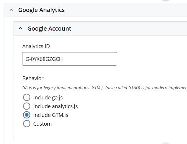
If you do not have a google analytics account, you can put in a ticket at the help desk to tie your Emory netid with a Google account following the guide on this knowledge base article. After your Google account is created, log in to your Google Analytics interface to create a specific analytics account for your site. You can view instructions for creating new analytics accounts on Google's website.
If your site already has an analytics account but you don't have access, follow the Google analytics account recovery instructions.
Enter your Google Tag ID under at the /_cms/site-configuration/Site Wide Configuration block. The full site needs to be published after changing these settings.
9.3 Specify Redirects
If you are transitioning from an old to new site, it is extremely important to specify redirects if you have changed your folder structure. Even if pages or directories have been removed, search engines and external websites will have your old links saved, and to avoid user frustration redirects should be provided as much as possible. If you've removed pages or documents you can redirect these old URLs to your new homepage.
Download Excel template for specifying redirects