Home » Style Guide » Navigation Patterns
Navigation Patterns
The Standard Template includes built-in navigation patterns that will work for most sites.
Utility
At the very top of this page, on the right hand side, is the utility navigation. It includes links to all of Emory's Schools and Colleges, common Library-related links, and common university-wide resources.
Main
Right below the header is the main navigation. By default, it sits in a light blue bar with dark blue text. There are "themes" for this navigation that allow you to select a pre-approved, Emory-branded color.
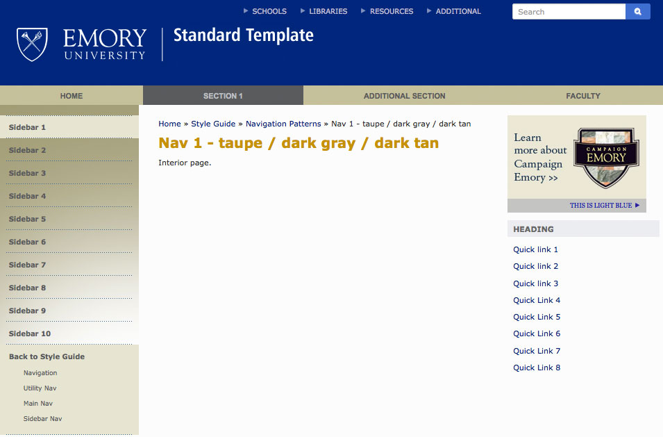
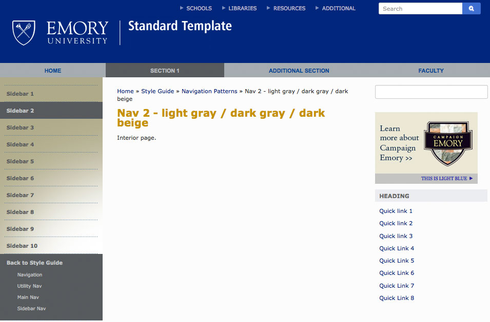
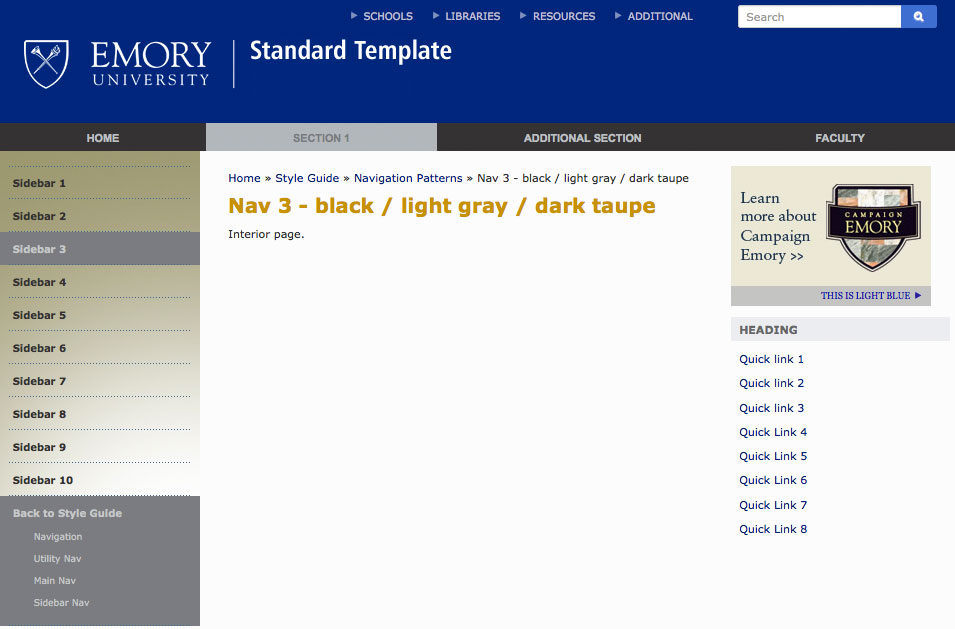
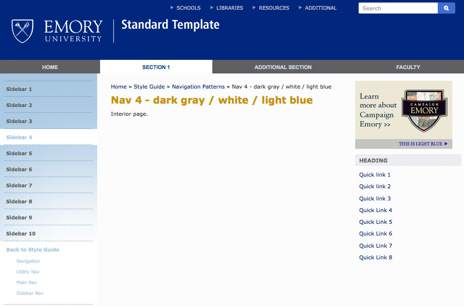
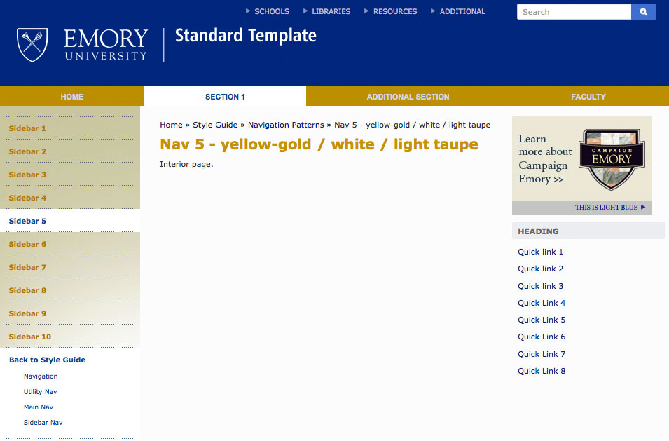
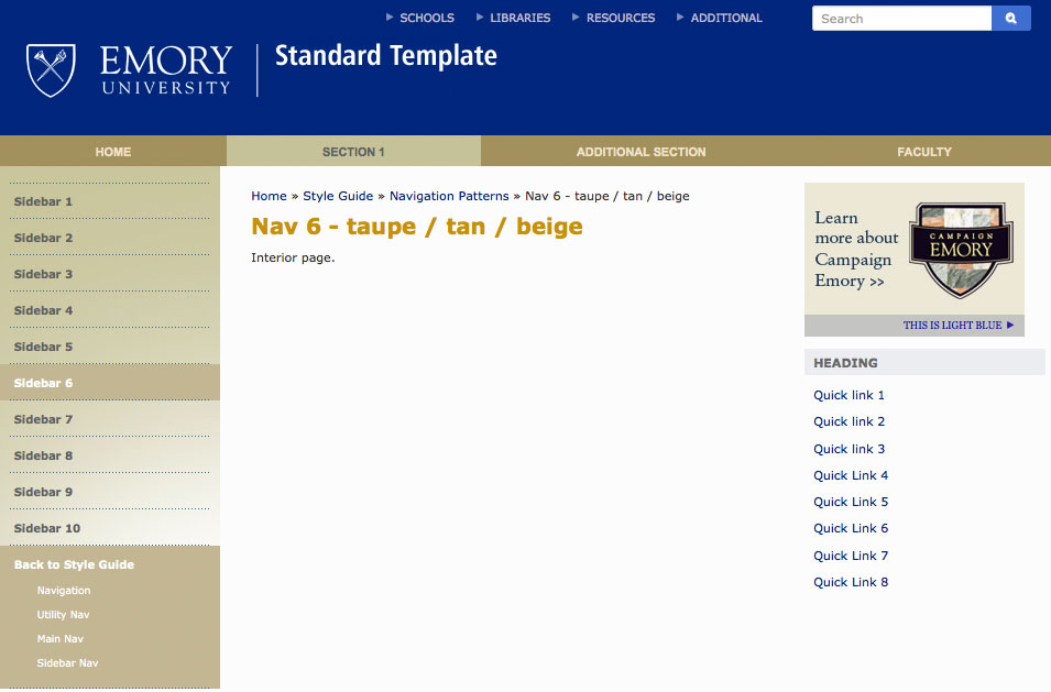
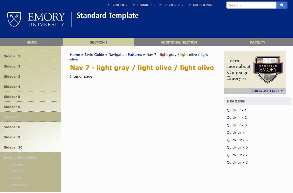
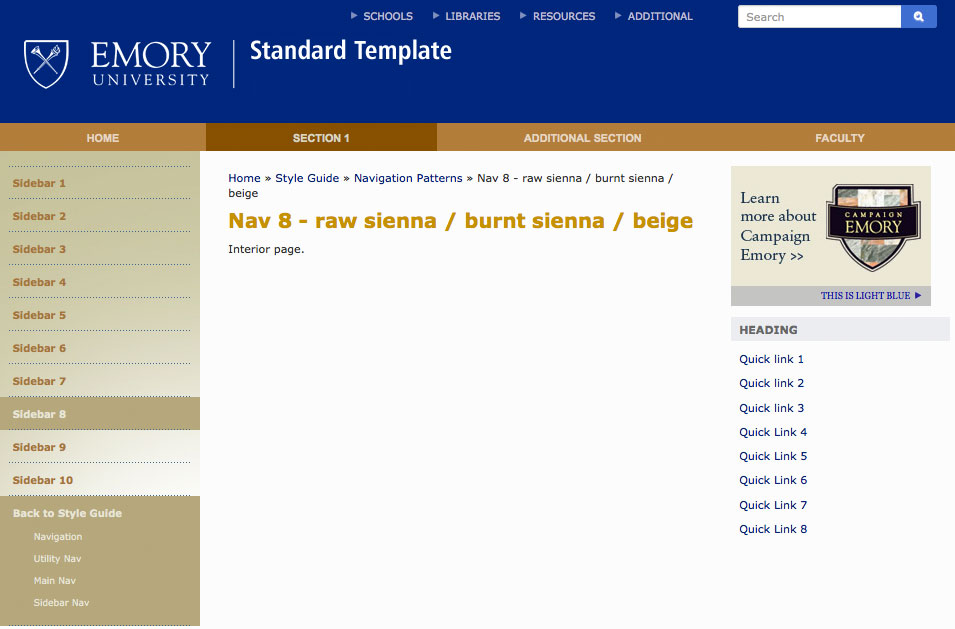
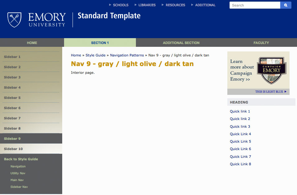
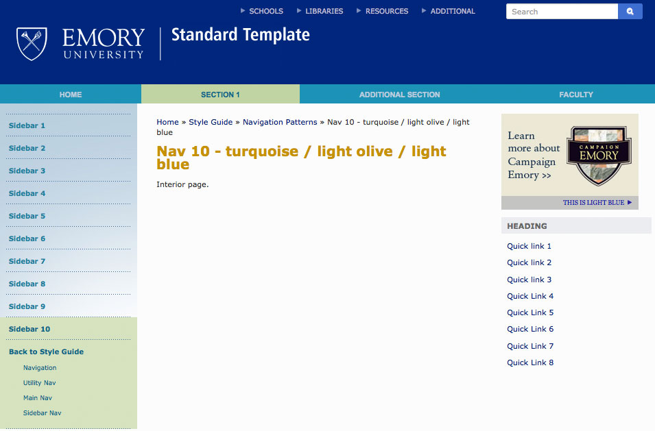
Below are the names of each theme, and a screenshot of the main navigation in that theme.
blue

gold

black

khaki

1 - taupe / dark gray / dark tan
2 - light gray / dark gray / dark beige
3 - black / light gray / dark taupe
4 - dark gray / white / light blue
5 - yellow-gold / white / light taupe
6 - taupe / tan / beige
7 - light gray / light olive / light olive
8 - raw sienna / burnt sienna / beige
9 - gray / light olive / dark tan
10 - turquoise / light olive / light blue
Sidebar
Shown at left is the default style for sub-navigation in the sidebar. Standard Template sites have navigation that can be thought of in levels - utility (at the very top of all Standard Template sites), main (in the horizontal bar underneath the logo), and the sidebar (to the left), and this affects what can be displayed by the sub-navigation. It works like this:
- First level: the main navigation bar
- Second level: the first level of the sidebar (the links that say Navigation, Components, Colors, etc.)
- Third level: the indented level in the sidebar (the links that say Sidebar 1 through Sidebar 10). In the example, Navigation is the link that is currently being visited.
The sidebar also has "themes" with pre-approved, Emory-branded color schemes corresponding to the themes for the main navigation. You can see the full themes in the tabs above, or you can see the sidebar themes by themselves with the sidebar links above - Sidebar 1 through Sidebar 10.
