Components
"Components" are special chunks of content that can be used in different areas of the website, such as on the homepage, or on the right column of an interior page. The following sections will describe the different components in greater detail. This page details components that can be used on both interior pages and the homepage. Additional documentation is available for homepage-only components.
Callouts
To create a callout, use the New > Components > Callouts > Callout Asset Factory.
Background Color
If you do not wish to use a specific image for your callout, you may specify a background color.
Desktop

Mobile
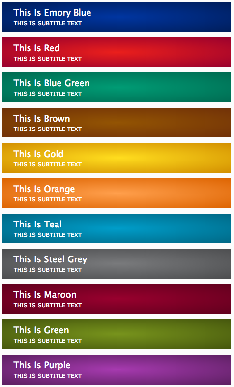
The white text over the callout is specified by the Title (see Content below).
Content
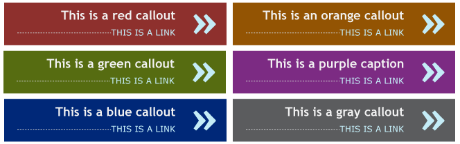
Internal Image: To create a new callout image, use the New > Components > Callouts > Image - 200x120 Asset Factory. You can browse to the image you want to insert by clicking the file button  , navigating to the images/callouts folder, and selecting the image. Callout images must be sized to 200x120 pixels exactly.
OR External Image: Specify the URL to the image, starting with "http://". Callout images must be sized to 200x120 pixels exactly.
Title: If you haven't selected a callout image, this text will appear over the specified Background Color. Only plain text can be entered in this field; please limit to 20 characters to prevent the text from extending beyond the image space.
Mobile Background Color
When pages are viewed on smaller screen devices, the callout design changes to a layout more conducive to that view. You can select the following mobile view colors:
Note that this option is not enabled unless you specify a callout image.
Link
- Subtitle: Only plain text can be entered in this field; please limit to 1-3 words to prevent the text from wrapping to a second line. This text will display below the callout image in the thin grey bar, and below the Title text on mobile view.
- Link to Internal Page: If you are creating a link to a web page within the Cascade site, click on the blue Page or Browse [] icon for the Internal Link option.
- OR Link to External URL: If you are creating an external link (to a webpage outside of the website or one that is not yet migrated into the CMS), type the full url (starting with http://) into the External Link URL box.
- Open link in new window
Callouts are placed in the /components/callouts folder.
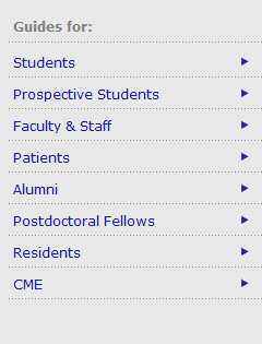
Audience Navigation
To create a new Audience Navigation component, use the New > Components > Audience Navigation Asset Factory
Heading
This entry is optional; only plain text can be entered in this field
Links
For each link to be added on the list, please enter a title in the Link Text field. This will become the text for the link.
Next, choose a link type:
- If you are creating a link to a web page within the Cascade site, click on the blue Page or Browse [] icon for the Internal Link option.
- If you are creating an external link (to a webpage outside of the website or one that is not yet migrated into the CMS), type the full url (starting with http://) into the External Link URL box.
- If you are creating a link to a file (e.g. a PDF or other document), click on the orange File or Browse [] icon for the System File link option.
 |
To create an additional link, click on the + (plus sign) icon. This will create a new link entry as detailed above. |
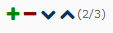 |
To move a link up or down in the list, click on the up or down arrow icons. |
 |
To delete a link, click on the minus sign icon next to the link. |
Feature
To create a new Feature, use the New > Components > Feature > Feature Asset Factory.
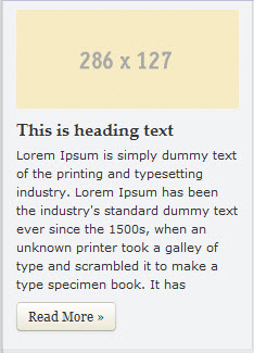
Photo
To create a new Feature photo, use the New > Components > Feature > Image - 286x127 Asset Factory. Feature photos must be 286 x 127 pixels. You can browse to the image you want to insert by clicking the file button , navigating to the images/feature folder, and selecting the image.
Heading
This entry is optional; only plain text can be entered in this field
Caption
Only plain text can be entered in this field
Read More Link
Please enter a title in the Link Text field. This will become the text for the link.
Next, choose a link type:
- If you are creating a link to a web page within the Cascade site, click on the blue Page or Browse [] icon for the Internal Link option.
- If you are creating an external link (to a webpage outside of the website or one that is not yet migrated into the CMS), type the full url (starting with http://) into the External Link URL box.
- If you are creating a link to a file (e.g. a PDF or other document), click on the orange File or Browse [] icon for the System File link option.
Feature components are placed in the /components/features folder.
News Center Widget
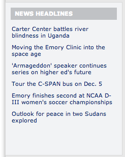
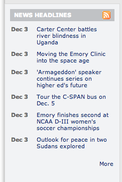
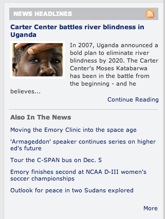
The News Center Widget component generates formatted headline listings from the Emory News Center, with three layouts available.
Headlines Only:
Headlines with Dates:
Feature Story Above:
Please note that this layout is intended for use with News Center feeds that contain a thumbnail. You must use the Atom format of the feed as opposed to a generic RSS feed. Please see the Additional Notes at the end of this section for more information.
To create a News Center Feed, use the New > Components > News Widget Asset Factory. News widget components are placed in the /components/news-widget folder.
URL for Feed: enter the URL for the News Center feed. News Center feeds always have a .xml file extension. Please see that Additional Notes at the end of this section for more information about News Center feed URLs.
News Block Layout Type: Please choose one of the following: Feature Story Above, Headlines Only, or Headlines with Dates.
Number of Stories: 4-6 (maximum of 6), including feature
Open Links in new window: select this option if you want the headlines to open in a new window.
Override Feed Title: if you enter text here, it will be used as the feed heading. If no text is entered, the feed's original title will be used.
Advanced Options
There are additional advanced options which you can configure if needed.
- Disable Feature Treatment: applies only to the Feature Story Above layout. That layout includes a thumbnail, headline link, summary, and continue reading link.
- Remove Feature Thumbnail Only – use this option if you are using the Feature Story Above layout, and want to disable the thumbnail
- N/A (leave this checked if you don’t want to adjust the feature)
- Feature: Read More Link Text: Default is “Continue Reading”
- Heading for Regular Headlines Block: Default is “Also in the News”
- View All Link Text: Default is "View All” – text for link after last headline on some layouts
- View All/Main Feed HTML Link: allows you to set a main “click back” link to an HTML page other than the source feed directly.
- News Widget Unique Name: for developers; if you need to change the automated ID for the news feed instance, enter a unique ID here.
- Alternate Subscribe URL: if you want the orange feed icon to link to a feedburner account, or alternate subscribe url, enter it here
Additional Notes
To find a News Center feed, visit the following list: http://news.emory.edu/tags/index.html, or locate other feeds on the Site.
Emory News Center feeds are delivered in both Atom and RSS format. It is recommended use the Atom version of the feed. To find the Atom feed URL, a complete list of available feeds is provided.
Misc Feed
The Misc Feed component is used on the homepages only, and provides a means of using misc RSS or Atom feeds on the homepage. This is an alternate, more generic option for feeds from a variety of external sources which may not work properly with the News Center Widget option. Please note that this option, like the News Center Widget requires the use of a valid RSS or Atom feed source for proper functionality.
This component also requires that you publish your homepage to refresh the headlines from your feed. If you have a frequently updated feed, you may want to request a Scheduled Publishing job be established for your homepage. Please contact UTS or the Web Design Group for assistance.
To create this element:
Go to New > Homepage > RSS Feed. The element will be created in the /components/misc-feed-block folder.
System Name: provide a name for the component (this will be used within Cascade only).
Fill out the optional Inline Metadata section:
- Override Feed Title: By default, the original feed title is used for the feed’s heading on the homepage; use this option to provide your own title as desired. Note that space on some homepage layout selections may be limited, so a brief title is recommended.
- # of Headlines: select between 4-6 headlines.
- Show Story Dates: Check the box for Yes if you want dates shown by each story.
- Story Summaries: select Do Not Display, or First Story. If you select First Story, it gives a feature-like treatment to the first story only.
- Override View More URL: by default, the View More link goes back to the original feed source. Use this option to provide a different URL that visitors can click through to.
- Override Feed Subscribe URL: by default, the orange feed icon will link back to the original feed URL. Use this option to provide a different URL for the icon (for example, a Feedburner account).
Feed URL: add a URL for your RSS or Atom feed (required).
Profile
To create a new Profile component, use the New > Components > Profile > Profile Feature Asset Factory
Heading
This entry is optional; only plain text can be entered in this field
Import Bio
Click on the blue Page or Browse [] icon to select a profile page; this option will automatically populate the Profile Feature with the following information:
- Name: Imported from Title of Bio page
- Summary or Quote: Imported from Summary of Bio page
- Photo: Imported from Main Photo of Bio page
- Read More Link: Links straight to Bio page
Blurb Type
Summary
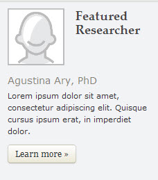
Quote
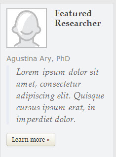
Manual Entry
Use this option to override any information from the Import Bio option:
- Photo: To add a new profile photo, use the New > Components > Profile > Image - 200x120 Asset Factory. You can browse to the image you want to insert by clicking the file button , navigating to the images/bio folder, and selecting the image. Profile images must be 200x120 pixels
- Name: Plain text only (character limit?)
- Quote or Summary: Plain text only
Read More Link
Please enter a title in the Link Text field. This will become the text for the link.
Next, choose a link type:
- If you are creating a link to a bio page within the Cascade site, click on the blue Page or Browse [] icon for the Internal Link option.
- If you are creating an external link (to a bio page outside of the website or one that is not yet migrated into the CMS), type the full url (starting with http://) into the External Link URL box.
Profile components are placed in the /components/profiles folder.
Quicklinks
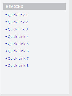
To create a new Quicklink set, use the New > Components > Quicklinks Asset Factory.
Heading
This entry is optional; only plain text can be entered in this field
Links
For each link to be added on the list, please enter a title in the Link Text field. This will become the text for the link.
Next, choose a link type:
- If you are creating a link to a web page within the Cascade site, click on the blue Page or Browse [] icon for the Internal Link option.
- If you are creating an external link (to a webpage outside of the website or one that is not yet migrated into the CMS), type the full url (starting with http://) into the External Link URL box.
- If you are creating a link to a file (e.g. a PDF or other document), click on the orange File or Browse [] icon for the System File link option.
|
To create an additional link, click on the + (plus sign) icon. This will create a new link entry as detailed above. |
|
To move a link up or down in the list, click on the up or down arrow icons. |
|
To delete a link, click on the minus sign icon next to the link. |
Quicklink components are placed in the /components/quicklinks folder.
Testimonial
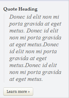
To create a new Testimonial component, use the New > Components > Testimonial Asset Factory.
Heading
This entry is optional; only plain text can be entered in this field
Quote
Only plain text can be entered in this field
Source:
This entry is optional; only plain text can be entered in this field
Read More Link
Please enter a title in the Link Text field. This will become the text for the link.
Next, choose a link type:
- If you are creating a link to a web page within the Cascade site, click on the blue Page or Browse [] icon for the Internal Link option.
- If you are creating an external link (to a webpage outside of the website or one that is not yet migrated into the CMS), type the full url (starting with http://) into the External Link URL box.
- If you are creating a link to a file (e.g. a PDF or other document), click on the orange File or Browse [] icon for the System File link option.
Testimonial components are placed in the /components/testimonials folder.
Trumba Calendar
Trumba Calendar components are comprised of a heading, and a code snippet that generates the calendar information. Please consult with your local unit's Trumba administrator to get the correct code snippet.
To create a new Trumba component, use the New > Components > Trumba Spud Asset Factory.
Heading
This entry is optional; only plain text can be entered in this field
Paste in Spud Code
Copy your code snippet from your Trumba calendar, or copy the code sent to you by your calendar administrator.
Paste code into the provided space.
Trumba components are placed in the /components/trumba-calendar folder.
Component Placement
Order of Components' Display
The overall visual order in which components display is determined by one of the following:
- For homepages, the order in which Rows and Items are configured
- For interior pages right and left columns, the overall Folder Order within the /components folder.
As an example, if you wanted to set a series of callouts on every page in the right column, and for that to be followed by a social media icon set, you will need to adjust the overall folder order within the components folder so that the callouts subfolder is #1, and social-media-list folder is #2. If you have multiple instances of a component displaying, such as callouts, those are also determined by their folder order within the /components/callouts folder.
Component-Level Selection
For all components, the following placement options are available:
- Select Sitewide Right to display the component on the right column of every page besides the homepage.
- Select Selected Pages Right to display the component on the right column of only specified pages: if you choose this option, click the button under Display on Selected Pages to identify which pages you’d like the component to appear. You may click the plus icon to display the callout on additional pages.
Callout-Level Selection
For callouts, the previously noted placement options are available, but callouts may also be placed on the Left Column, under the sub-navigation, on pages that use the subnavigation element. Please note that when pages are viewed using a mobile device, the Left placement option is displayed at the visual bottom of the page, above the footer; this option is not recommended for critical content display.
- Select Sitewide Right/Left to display the column on the right column, or left column under the navigation, of every page besides the homepage
- Select Selected Pages Right/Left to display the component on the right column, or left column under the navigation, of only specified pages: if you choose this option, click the button under Display on Selected Pages to identify which pages you’d like the component to appear. You may click the plus icon to display the callout on additional pages.
Interior Page-Level Selection
Components can also be added to the right column by editing the specific page's Sidebar Items:
- Add to existing site-wide set: Adds component to right column along with any components of that same type marked Sitewide Right. For example, if you had established 2 Site-wide callouts that appear on every page, but wanted to add one more callout to this page, use this option.
- Replace site-wide set: Replaces any of the same component marked Sitewide Right; for example, if a Feature is specified with this option, it will replace any Feature marked Sitewide Right, but will not disable any other component type specified
- Do not display this type: Disables display of specific component type on specific page's right column sidebar
Social Media
This component works with information you enter on the Site Settings page for your social media accounts, and allows you to quickly build icon sets with different layout options. Social Media components are placed in the /components/social-media-list folder.
To create a new Social Media Icon set, use the New > Components > Social Media List Asset Factory. Enter the following:
Heading: optional; plain text only
Heading Style: select Boxed or Unboxed.
Icon Size: Select one of the following:
Show Link Text: Optional
If you enable this option, a text link will appear in addition to the icon (corresponding to the Social Media Account's Type or custom Name as specified in the Site Settings).
If you do not display text, your icons will display in a horizontal list. If you do display text, the list will be vertical.
Layout Examples
Large - Boxed Heading - No Text
Medium - Unboxed Heading - Text
Back to top