Structured Page
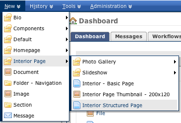
To create a new Structured Page, use the New > Interior Page > Interior - Structured Page Asset Factory.
Each content field includes a blank WYSIWYG box. Within the Standard Template, it's important to note that the WYSIWYG contains some custom styles that you can use. They are located in the Styles dropdown at the top center of the formatting bar.
Metadata
When you create a new interior page, there are a few fields you'll want to use to describe it.
System Name
When you create a new page, you assign a System Name to it, and this creates the filename for the page (ex: colleges.html). System names should be all lowercase, and contain no spaces or special characters. Separate words with dashes (e.g. emory-university-school-of-medicine) or underscores.
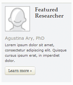
If you are creating a bio page, be sure to name it lastname-firstname.
Title
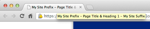
The Title field is used in several places. The most visible is at the top of the page, in the large gold text. It is also visible at the very top of the browser window, alongside the site's name (or prefix and/or suffix, if you have configured these) which can be set up in site settings. Some browsers will only display a portion of the title; others will display the whole thing. Search engines may also cut off titles.
Titles are very important for both users and search engines to understand what is on a page, and should thus be very focused. Try to keep this text between 65 and 70 characters. If you are creating a bio page, enter the title as Firstname Lastname, Degree (e.g. John Smith, PhD).
Summary
In the interior page layouts, the Summary field is not displayed; rather it is used for some section page layouts or components. If your interior page is included on a thumbnail section listing, the Summary field is what will be used to tell users about the page. This text should be a brief summary of what users will find when they visit the page, and why it is important. Generally, two or three small sentences is great for this purpose.
Description
The description field is not viewable on your site itself, but rather in Google's search results if Google feels that the text appropriately describes the page. It does not give you better rankings, but it can potentially make it easier for users to find out whether the page has the information they are looking for before they visit. Google will use a maximum of 160 characters.
This image is how Emory University's home page appears in Google search results:
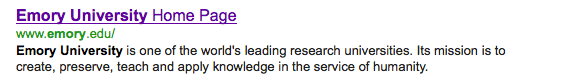
Emory University's description is short and to the point, but informative. Google (and Google's users) responds well to this.
Thumbnail
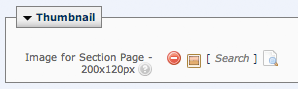
Thumbnails are used on both types of section page layouts, so if you intend to display your interior page on a section page, you will need to assign a thumbnail image to it. For both basic and structured interior pages, you can add a thumbnail by using the New > Interior Page > Interior Page Thumbnail - 200x120 Asset Factory. You can browse to the image you want to insert by clicking the file button  , navigating to the images folder and the proper subfolder, if applicable, and selecting the image. These images must be 200x120 pixels. Once you have uploaded the image, you can assign it to the page.
Sidebar
The sidebar is optional; if you would prefer a wider main column you aren't required to use sidebar. By default, your page will use any sitewide settings that are in place for components. If there are none, the sidebar will not be displayed.
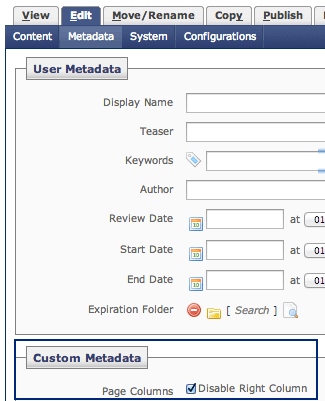
If there are sitewide sidebar settings for components, you can disable the sidebar for your page. Go to the Edit screen and click Metadata, and select Disable Right Column in the Custom Metadata section.
If you do decide to use the sidebar on your page, it is setup just like other sidebars.
Specific Options For Structured Pages
The structured interior page gives you more options for how to format your content, and also for what kinds of content can be on the page without writing code for them.
Page Options
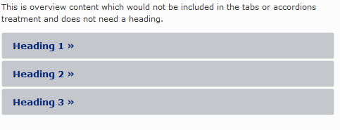
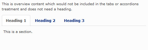
The structured page consists of multiple sections following the overview content. You can choose to display the content normally, so that all are visible as a user scrolls down the page, or you can use the accordion layout, in which only one of the sections is visible at a time, or the tab layout, in which there are horizontal buttons that switch which section is visible. The final option is FAQs, in which each section of the page is a question and answer pair.

Accordion
Tabs
FAQs
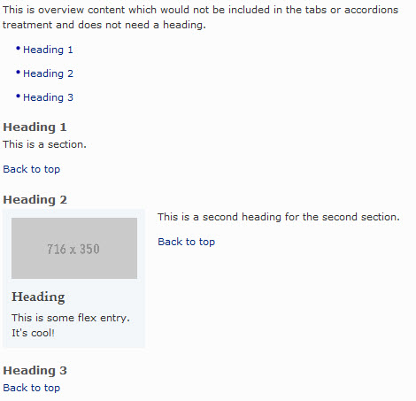
Overview Content
Overview content is an optional area of your page that, if you use it, will always be visible above the sections that might display as acordions, tabs, etc. You could use this to highlight something, give summary information, etc.
Main Image or Media
If you want to use this area to display a prebuilt type of content, you have the following options:
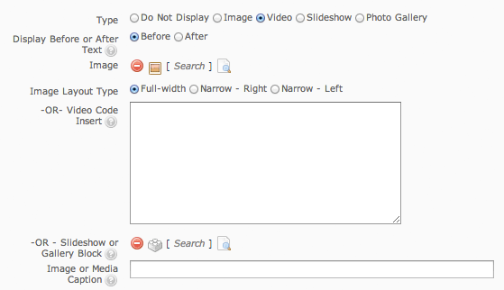
Type: There is separate documentation for slideshows and photo galleries, as they need to be created before they can be applied.
Display Before or After Text allows you to display what you choose above either before or after the flex entry.
Image: You can browse to the image you want to insert by clicking the file button , navigating to the /images folder, and selecting the image.
Image Layout type should match the size of the image.
Video Code Insert: To display a video, we recommend using YouTube, and pasting in the embed code that you get when clicking "Share" and "Embed" on a YouTube video.
Slideshow or Gallery Block: These blocks must be created before you add them to your page:
Once you have created one of the above, you can apply it by clicking "-OR - Slideshow or Gallery Block" and selecting it from the correct folder.Image or Media Caption: Only plain text can be entered in this field.
Flex Entry
The flex entry box is simply a WYSIWYG box, in which you can type formatted text.
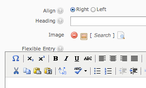
Inset Sidebar
If you chose a narrow option above, you can also create a sidebar in this area. This does not replace or change the page level sidebar, and is much simpler. You can enter a heading, an image, and/or use a flexible entry box for WYSIWYG formatting.
Section(s)
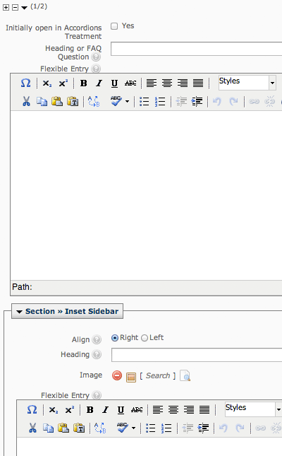
Below the "overview" you can create as many sections as you need. Each one consists of a heading (which is also used for FAQ questions), a flexible entry box (which is also used for FAQ answers), and an inset sidebar where you can enter a heading, an image, and/or use a flexible entry box for WYSIWYG formatting.
Use the + and - options to add or remove sections. If you are using the accordion option, you can check Yes in the "intially open in Accordions Treatment" box, and that section will be visible to users when the page first opens. Otherwise, it will be hidden until its heading is clicked.
Basic Formatting
The Main Page Content > Main Entry box controls the central content area of the webpage’s layout.You can enter text and apply basic formatting such as bold, italics, headings, bulleted lists, etc. using the WYSIWYG toolbar. You can also use the toolbar to create links, add tables, and insert images. For more information, please refer to Hannon Hill’s official documentation:
http://www.hannonhill.com/kb/WYSIWYG/
Pasting Copied Text
If you have copied text from another application such as Microsoft Office (Word, Excel, Powerpoint, Outlook, etc.) to paste into your web page, you can use one of two buttons in the toolbar: Paste or Paste as Plain Text (marked with a “T”).

It is recommended to use the Paste as Plain Text button, so that your pasted content does not contain unwanted code that can cause formatting problems in the standard web layout. Also, the regular Paste button may require some extra steps to be enabled for use in Firefox.
Whenever copying from the Microsoft Suite, once you’ve entered text into the WYSIWYG, highlight the text and hit the “Cleanup messy code” and “Remove formatting” buttons shown below to remove extraneous styling tags that might cause your text to show up differently than it appears in the WYSIWYG once you hit “Submit”.

Line Breaks
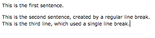
By default, if you hit Enter (or Return for Mac users) after a line of text, the system creates a paragraph break, which looks like a double-line break. To create a single line break, hit Shift + Enter.
Paragraphs
Make sure that any text you enter is wrapped in a paragraph, or your formatting may look strange, and the lines of text will run too closely together. To wrap a block of text in a paragraph, select some text, and choose Paragraph from the Format drop-down menu.
Headings
You can also use pre-set Headings, as you would in Microsoft Word, by using the Format drop-down list at the top of the toolbar. It’s highly recommended to use real headings to structure your page content, rather than adding manual line breaks and boldface to create the appearance of headings, because headings can be globally restyled later with much less effort. Heading 1 is the style used for the orange content-area title of the page, so start your content level headings from Heading 2 on.
Heading 2
Heading 3
Heading 4
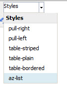
Styles
The Styles drop-down menu also contains special styling options for some elements. Please refer to the Style Guide for detailed information.
Creating Links
Internal Links
To link to an internal page or file (a page that exists in Cascade), click on the Link icon:

Click on the Internal button, then click on the Page or Browse [] icon next to the Link field.
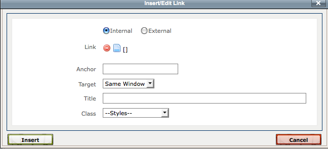
Browse the folders in the Choose… window that pops up to find the page you want to link to. Click on the + signs as needed to show additional subfolders.
Press Confirm to select the page or file when finished.
- The link Anchor refers to a specific spot in the page that you are linking to.
- The link Target controls whether or not the link opens a new window, or opens within the same window.
- The link Title is text that pops up if you mouse over a link; this is also optional.
Click on the Insert (or Update, if a link is already in place) button after your link is entered.
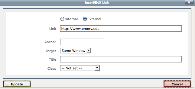
External Links
To link to an external page (outside of the Cascade site, or to a web page that has not been migrated into the Cascade CMS), click on the link icon, then click on the External tab. Type or paste in your external link, starting with http://. Click on the Insert (or Update) button when finished.
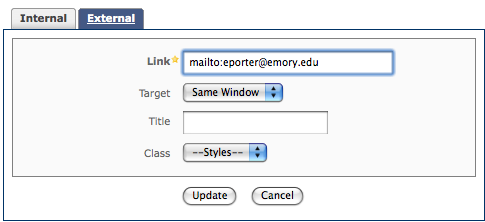
To create a link to an email address, use the process for creating an External link, but type mailto: at the beginning of the email address as shown below. Click on the Insert/Update button when finished.
Removing Links
Click on the link to select it, then click on the Break Link icon in the toolbar.

Images
System Name: System names for files, like pages, must be all lowercase, with no spaces or special characters. If you want to keep the original filename for the file you want to upload, you can leave this field blank. If you do change the filename, make sure you also type in the original file extension (e.g. “.pdf”), or the file may become corrupted.
Parent Folder: Images are placed in the /images folder.
In the Content > Data > File Upload area, click on Browse to select the file from your computer that you want to attach.
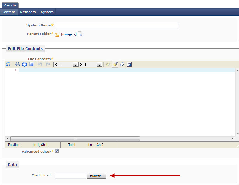
When finished, click on the Submit button to upload your new file.
Notes About Image Widths
For images inserted into the regular content area, images must be smaller than 520 pixels wide or the page layout will be distorted.To Insert an Image:
- Move your cursor to where you want the image to appear.
- Click on the Insert Image button.
- In the Insert Image popup window, determine if your image is located within the Cascade Site (Internal), or if the image is located on another website (External).
- For internal images, click on the [Search] icon next to Image. In the Choose popup window that appears, browse the appropriate images subfolder for the file you just uploaded. Click on the desired image to select it, then click Confirm.
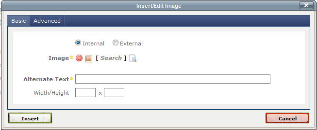
- For External images, click on the External button, then type or paste in the URL for where the image is located.
- Back in the Insert/Edit Image screen, add a brief description of the image in the Alternate Text box (this helps visitors with visual impairments to know what the image contains).
- Click Insert when finished.
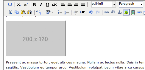
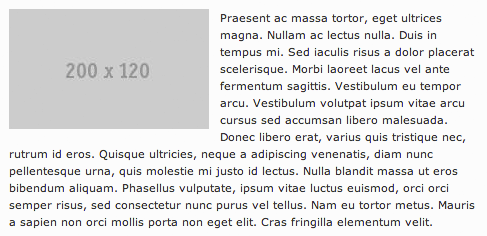
Image styles
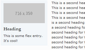
If you are adding images to the WYSIWYG, you can use pull-right and pull-left from the dropdown above. Images with these styles selected will align themselves to the right or left of your content, and text will flow around them if applicable. Below is a pull-left example. Pull-right works identically, with the image before the corresponding paragraph.
Lists
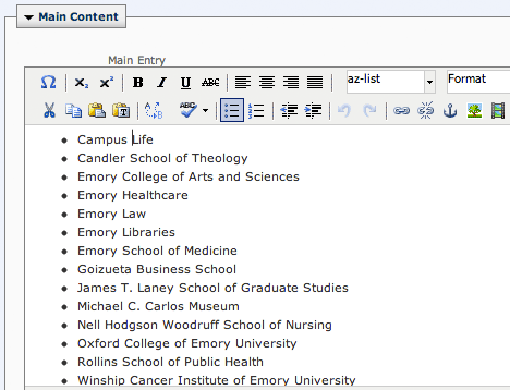
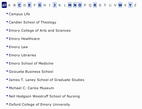
List styles
If you have a list that is in alphabetical order, you can display it as an easily filtered list by selecting az-list.
Documents
To upload a Document to Cascade, use the New > Document Asset Factory.
System Name: System names for files, like pages, must be all lowercase, with no spaces or special characters. If you want to keep the original filename for the file you want to upload, you can leave this field blank. If you do change the filename, make sure you also type in the original file extension (e.g. “.pdf”), or the file may become corrupted.
Parent Folder: Images are placed in the /documents folder.
In the Content > Data > File Upload area, click on Browse to select the file from your computer that you want to attach.
When finished, click on the Submit button to upload your new file.