Advanced Homepage
The Advanced homepage provides all of the Simple homepage layout options and introduces some new ones, such as the ability to add more than two rows, the ability to generate a horizontal row of callouts, and enables the "Stacked Element" option.
Top Row
The top row contains the large "hero" image and an optional column on either side. If you are using a Left or Right aligned hero image, you can also populate content in a column that displays adjacent to the image.
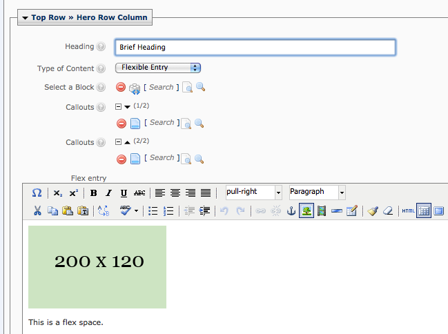
Hero Image
The hero image options are the same for the Simple Homepage and the Advanced version. When setting up your homepage, it may be helpful to create your images in advance. Please refer to the Hero Image section for more detail about creating the hero image.
Hero Column
The hero column options are similar to those available in the Simple Homepage builder, but adds a new component called Stacked Boxes.
Heading: The heading element is used by the Flexible Entry option only. Other components have headings which are assigned on their specific blocks.
Type of Content - You may choose from one the following options. Please select one item from the drop-down menu:
- Callouts
- Select Callouts from the drop down.
- Use the Callouts > Search page chooser to select callout pages from the /components/callouts folder.
- Note: you may only select two for the hero row position (the bottom row may have more than 2).
- Audience Nav: select this option from the drop-down list, and then use the Select a Block option to select an audience navigation block from the /components/audience-nav folder.
- Quick Links: select this option from the drop-down list, and then use the Select a Block option to select an audience navigation block from the /components/quick-links folder.
- Feature: select this option from the drop-down list, and then use the Select a Block option to select an audience navigation block from the /components/feature folder.
- Profile: select this option from the drop-down list, and then use the Select a Block option to select an audience navigation block from the /components/profile folder.
- Testimonial: select this option from the drop-down list, and then use the Select a Block option to select an audience navigation block from the /components/testimonials folder.
- Social Media Icons: select this option from the drop-down list, and then use the Select a Block option to select an audience navigation block from the /components/social-media-list folder.
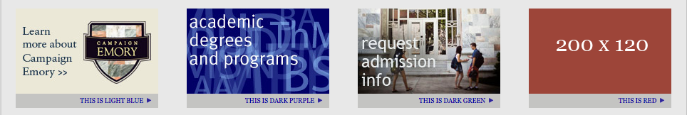
- Stacked Boxes: select this option from the drop-down list, and then use the Select a Block option to select an audience navigation block from the /components/home-stacked-element folder.
- Flexible Entry:
- Select Flexible Entry from the drop-down.
- Add an optional Heading.
- Enter your text in the Flex Entry space provided (beneath the Callouts selection options).
Additional Rows
The second, lower row can contain up to 4 columns worth of content. Column widths will be automatically generated based on whether or not your row contains callouts, and the number of columns that your layout contains.
Balanced Column Heights: At the top of the Bottom Row options, this setting (checked by default) will enable auto-adjustment of the height of columns entered in a row so that any of the gray box-styled elements created will appear balanced.
Row - Items
Use the Item controls to manage columns of content in your row. You may add, delete, or re-order these columns using the + or - or up and down arrow signs next to each column.
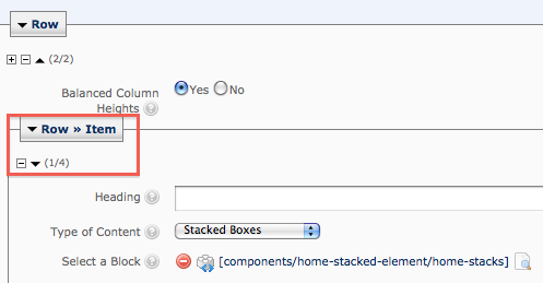
For each Second Row > Column entry, enter the following as appropriate:
Heading: This optional heading applies to Callouts or Flexible Entry components only.
Type of Content - You may choose from one the following options. Please select one item from the drop-down menu:
- Callouts
- Select Callouts from the drop down.
- Click on the Callouts > Search option to select callout pages from the /components/callouts folder.
- Click on the Plus sign icon to add additional callouts. You may add, remove, or re-order callouts using the +, -, and up and down arrows.
- You may select multiple callouts for the bottom row (unlike the Top Row, which is limited to 2).
- Leave the Callouts Display to Vertical stack unless you are creating a custom, horizontal callout row.
- Audience Nav: select this option from the drop-down list, and then use the Select a Block option to select the appropriate block from the /components/audience-nav folder.
- Quick Links: select this option from the drop-down list, and then use the Select a Block option to select the appropriate block from the /components/quick-links folder.
- Feature: select this option from the drop-down list, and then use the Select a Block option to select the appropriate block from the /components/feature folder.
- News Center Widget: select this option from the drop-down list, and then use the Select a Block option to select the appropriate block from the /components/news-widget folder
- Misc Feed: select this option from the drop-down list, and then use the Select a Block option to select the appropriate block from the /components/misc-feed-block folder.
- Profile: select this option from the drop-down list, and then use the Select a Block option to select the appropriate block from the /components/profile folder.
- Testimonial: select this option from the drop-down list, and then use the Select a Block option to select the appropriate block from the /components/testimonials folder.
- Social Media Icons: select this option from the drop-down list, and then use the Select a Block option to select the appropriate block block from the /components/social-media-list folder.
- Stacked Boxes: select this option from the drop-down list, and then use the Select a Block option to select the appropriate block block from the /components/home-stacked-element folder.
- Flexible Entry:
- Select Flexible Entry from the drop-down.
- Add an optional Heading.
- Enter your text in the Flex Entry space provided (beneath the Callouts selection options)
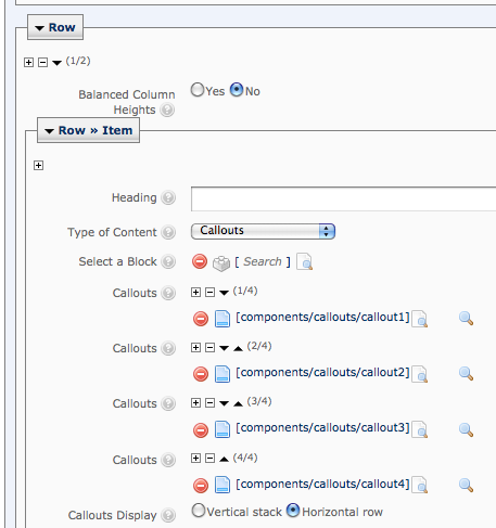
Horizontal Callout Row
An additional advanced layout option is to create a row of horizontal callouts.
To create this layout, do the following:
Create a new Row by clicking on the plus sign icon in the first Row after the Top Row for your page. Move the new Row to the top by clicking on the up arrow.
For Balanced Column Heights, select No.
Make sure you only have one Row > Item for your row. Delete any additional Items from the new row.
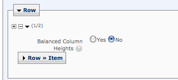
Do not supply a Heading.
For Type of Content, select Callouts.
Use the Callouts > Search option to select callouts from the /components/callouts folder. Select 4 to fill the row.
For Callouts Display, select Horizontal row.
Converting Simple to Advanced
Advanced users can switch from a Simple homepage to the Advanced homepage by using the following steps. Please contact the Web Design group if you need assistance converting from a Simple to Advanced homepage. Note: your site may temporarily lose its homepage while these steps are in process, so please plan accordingly.
- Run the New > Homepage > Homepage Advanced Asset Factory.
- Create your homepage at the top level of the site as a second homepage, in addition to your original Simple homepage.
- Populate all content and components as needed on the new page.
- If your top navigation includes a link to the homepage, update the link so that it points to the new homepage.
- Use the Move/Rename option to rename your original Simple homepage to something other than index, e.g. index-old.
- Rename the new homepage to index.
- Republish the new homepage and/or the entire Site, if your top navigation includes a link to the homepage.